Case Study
Designing a Clinical System That Draws Its Own Screens
How do you design hundreds of forms without designing hundreds of screens?
Design to Code Prototyping
Token Systems
Clinical UX
AI Interaction Design
Design Systems Architecture
400+ forms
the scale it was built for
400+ forms
the scale it was built for
3 tiers
token architecture
3 tiers
token architecture
8 weeks
system to working prototype
8 weeks
system to working prototype
V1 approved
cleared for funding
V1 approved
cleared for funding
My Role
Sole UI/UX designer, system owner
Timeline
8 weeks, April to June 2026
Team
Founder, lead engineer, clinical advisor, practicing nurses
Tools
Figma, Claude Code, Figma MCP, design-system.css
Scope
Responsive web, desktop and tablet
01 - The Problem
Clean slate, no room for error
HeartPulse is replacing a clinical system that's decades old, built on database software that was never meant to carry a product. 400 plus forms, over 100,000 lines of clinical logic, and no visual design. It handled care for a large patient population across multiple states, and it's now fully retired. Clean slate. The catch is who's on the other end of it: nurses caring for medically complex kids, some vent dependent, where a mistake isn't a mistake, it's a life. That's the problem HeartPulse set out to solve, and where I came in on UI/UX.

01 - The Problem
Clean slate, no room for error
HeartPulse is replacing a clinical system that's decades old, built on database software that was never meant to carry a product. 400 plus forms, over 100,000 lines of clinical logic, and no visual design. It handled care for a large patient population across multiple states, and it's now fully retired. Clean slate. The catch is who's on the other end of it: nurses caring for medically complex kids, some vent dependent, where a mistake isn't a mistake, it's a life. That's the problem HeartPulse set out to solve, and where I came in on UI/UX.
02 - The System
One template, hundreds of screens
The role started with a need for a design system to build the foundation of the software, but the real problem underneath it was scale. This is a product made of hundreds of forms, and I was never going to hand-draw hundreds of screens on part-time hours against a tight deadline. So the goal from early on was a system that could generate the product, not just style it.
I built a starter system in Figma structured to stay dynamic and editable. It ran on three layers of tokens: primitive tokens for the raw values, semantic tokens for meaning like foreground, surface, and status, and component-level tokens on top of those. The clearest proof it worked was the tone shift. The first pass had cold, clinical colors that didn't feel warm or inviting enough, so I changed the values at the semantic level and the entire system moved to a warmer tone at once, without me touching individual screens.
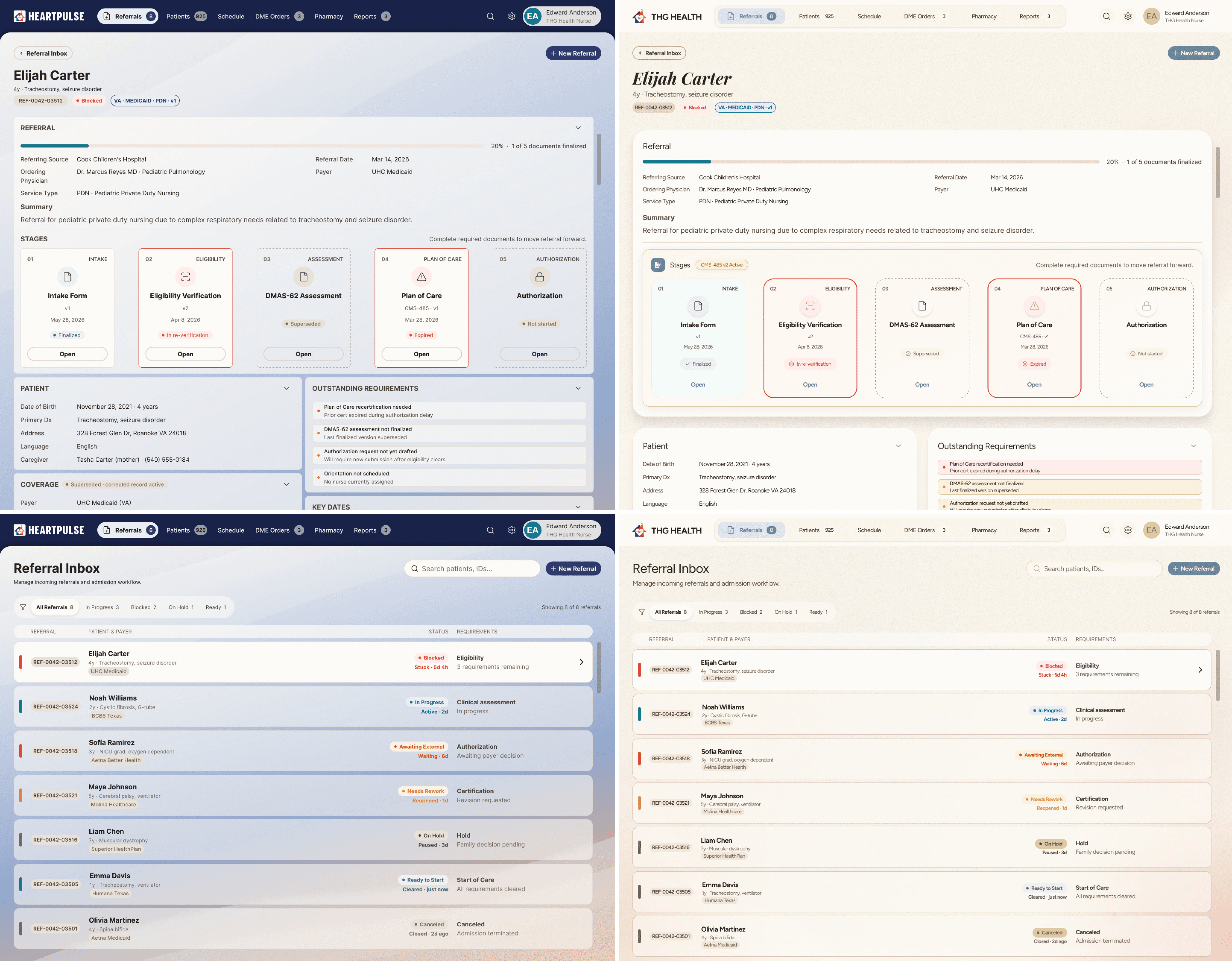
Cold interface to warm interface, edited through the design system
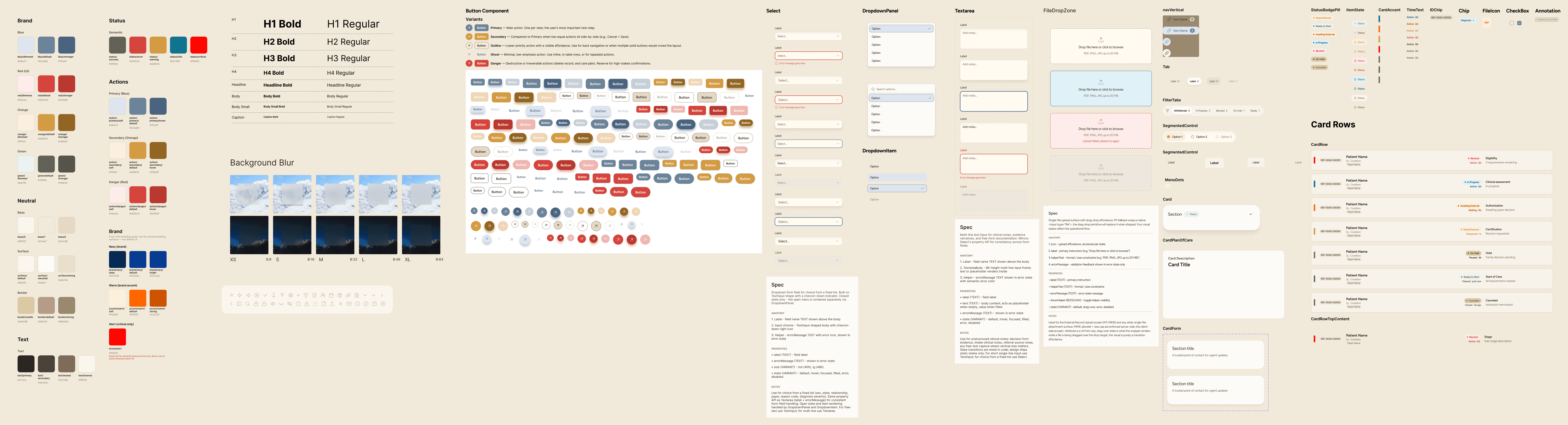
Figma Design System Snippet
The founder framed the domain in a way that reframed my whole job: healthcare is deterministic, it's all forms. So instead of designing hundreds of one-off screens, I treated forms as templates. You define a template once, attach it to an object in the system, and the form builder renders it wherever it's needed. I design the template, engineering parameterizes it per screen, and one edit updates everything downstream. That turned the work from drawing screens into building the thing that draws the screens, and it meant other people could stand up new forms without me in the loop.
Form Templates

Menus Using Templates

We started with the patient onboarding and referral flow, a set of forms plus a referral dashboard. The design system let me assemble screens fast and the engineer kept implementing them cleanly, which is where the template approach earned its keep.
02 - The System
One template, hundreds of screens
The role started with a need for a design system to build the foundation of the software, but the real problem underneath it was scale. This is a product made of hundreds of forms, and I was never going to hand-draw hundreds of screens on part-time hours against a tight deadline. So the goal from early on was a system that could generate the product, not just style it.
I built a starter system in Figma structured to stay dynamic and editable. It ran on three layers of tokens: primitive tokens for the raw values, semantic tokens for meaning like foreground, surface, and status, and component-level tokens on top of those. The clearest proof it worked was the tone shift. The first pass had cold, clinical colors that didn't feel warm or inviting enough, so I changed the values at the semantic level and the entire system moved to a warmer tone at once, without me touching individual screens.
Cold interface to warm interface, edited through the design system
Figma Design System Snippet
The founder framed the domain in a way that reframed my whole job: healthcare is deterministic, it's all forms. So instead of designing hundreds of one-off screens, I treated forms as templates. You define a template once, attach it to an object in the system, and the form builder renders it wherever it's needed. I design the template, engineering parameterizes it per screen, and one edit updates everything downstream. That turned the work from drawing screens into building the thing that draws the screens, and it meant other people could stand up new forms without me in the loop.
Form Templates
Menus Using Templates
We started with the patient onboarding and referral flow, a set of forms plus a referral dashboard. The design system let me assemble screens fast and the engineer kept implementing them cleanly, which is where the template approach earned its keep.
03 - The Pivot
Forms don't carry much emotion
We were building forms, and forms don't carry much emotion. The scope for what would best showcase HeartPulse was still open, so we kept talking it through, with each other and with actual nurses. The founder landed on a flow that would really show off the product, a nurse's landing page.
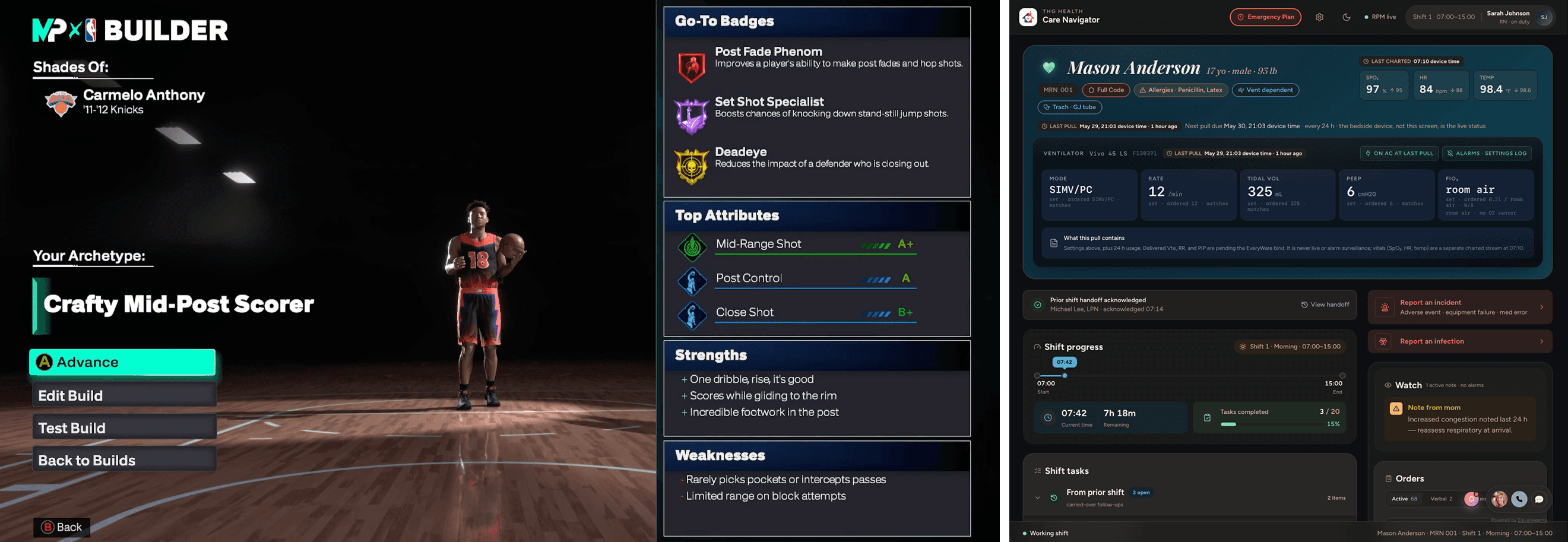
The idea was a nurse's command center, the Care Navigator. A place where the whole shift could be tracked. What's pending from the last shift, what's due now, later, and by end of shift. Patient statuses, medications, orders. Plus an AI nurse feature that nudges on anything important and answers questions within the context of the current patient.

Every setting shows what's set against what was ordered, so a mismatch reads at a glance. Last pull and next due are stamped because the bedside device is the live source, not this screen.
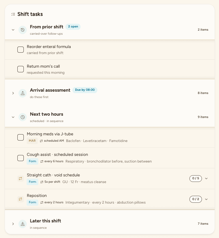
Grouped by when, not what. Carried over, due by 08:00, next two hours, later. The nurse doesn't triage a flat list.

The interface does the cooldown math. Next available and doses used today are shown, instead of a last given timestamp the nurse has to work from.
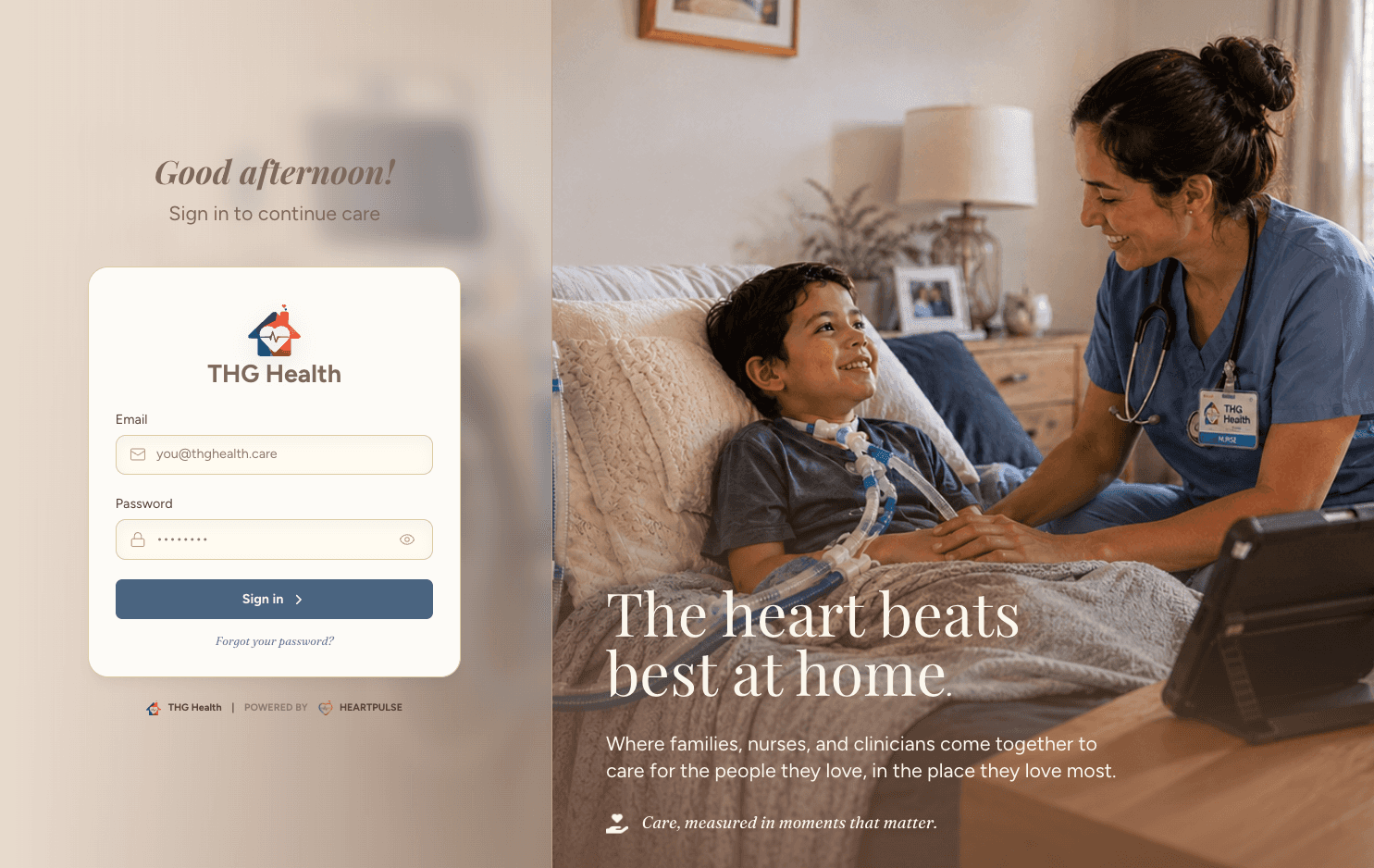
I pitched that the emotion could come from a warm palette, rounded edges, and a welcoming login screen.
The AI nurse feature is Ask Jane. It sits inside the shift, answers questions in the context of the current patient, and nudges when something's missing or due. The rule I set was that Jane stays quiet unless it matters. Rare, high-impact nudges only. A chatty assistant becomes wallpaper in a day, and alert fatigue in a clinical tool is a safety problem, not just an annoyance.
The layout came from somewhere unexpected. I spent 10 years leading UI on NBA 2K, and one of those player-hub screens maps almost cleanly onto a nurse's shift. Hero patient in the center where the athlete used to be, care team roster down the side, stacked quick actions, status panels around the edges. Same craft, pointed at a nurse taking care of a dying child instead of a box score.
03 - The Pivot
Forms don't carry much emotion
We were building forms, and forms don't carry much emotion. The scope for what would best showcase HeartPulse was still open, so we kept talking it through, with each other and with actual nurses. The founder landed on a flow that would really show off the product, a nurse's landing page.
The idea was a nurse's command center, the Care Navigator. A place where the whole shift could be tracked. What's pending from the last shift, what's due now, later, and by end of shift. Patient statuses, medications, orders. Plus an AI nurse feature that nudges on anything important and answers questions within the context of the current patient.
Every setting shows what's set against what was ordered, so a mismatch reads at a glance. Last pull and next due are stamped because the bedside device is the live source, not this screen.
Grouped by when, not what. Carried over, due by 08:00, next two hours, later. The nurse doesn't triage a flat list.
The interface does the cooldown math. Next available and doses used today are shown, instead of a last given timestamp the nurse has to work from.
I pitched that the emotion could come from a warm palette, rounded edges, and a welcoming login screen.
The AI nurse feature is Ask Jane. It sits inside the shift, answers questions in the context of the current patient, and nudges when something's missing or due. The rule I set was that Jane stays quiet unless it matters. Rare, high-impact nudges only. A chatty assistant becomes wallpaper in a day, and alert fatigue in a clinical tool is a safety problem, not just an annoyance.
The layout came from somewhere unexpected. I spent 10 years leading UI on NBA 2K, and one of those player-hub screens maps almost cleanly onto a nurse's shift. Hero patient in the center where the athlete used to be, care team roster down the side, stacked quick actions, status panels around the edges. Same craft, pointed at a nurse taking care of a dying child instead of a box score.
04 - The Prototype
Designed in Figma, built in code
To make it real, I moved off Figma and built the landing page as a high-fidelity, functioning prototype. Not connected to a database, but fully navigable. I built it in Claude Code, strictly based on the design system I'd already made.
I ported the design system from Figma into code using Claude Code with Figma's MCP integration. It lived as a design-system.css and visually as a debug page in the app, so I could reference every component, color, and font from one organized page. That was faster than Figma in a way. When I described what I needed, I could point at that page and tell it to use exactly what I meant.
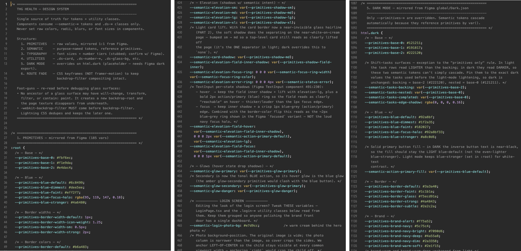
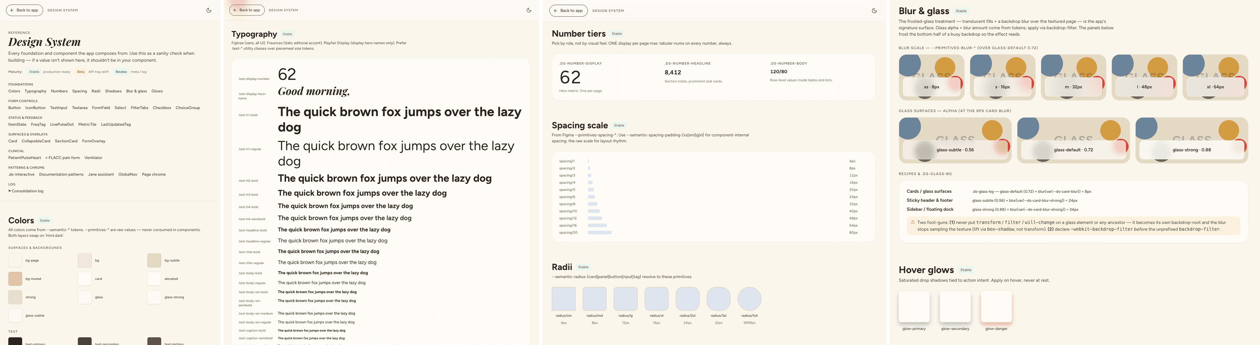
Claude Code Design System Snippet
I'd still go into Figma to design specific parts by hand, like the ventilator and patient section, then connect Claude Code and have it replicate them in code. That became the flow. I'd design parts of a screen, and Claude Code would apply that design across the UI and wire up the functionality, all pulling from the same tokens so the coded version stayed consistent with the source.
Some of what made it in:
A task manager with grouped lists, draggable and priority-driven
A ventilator UI built against the device's real data model
Multiple ways to log patient statuses like suction and medication
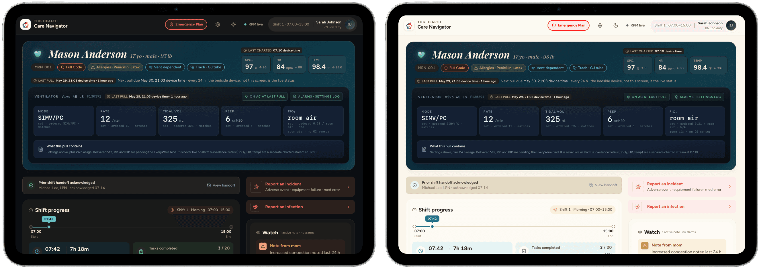
Light and dark themes, both warm in tone
An AI assistant that plugs into other sections to nudge missing tasks or actions
Because the patient was vent and trach dependent, accuracy meant clinical accuracy, not just clean UI. I built for the things that actually go wrong: a one tap emergency panel with trach and vent protocols and escalation contacts, a suction log that records character and not just time, running intake and output for a kid on GJ feeds, vitals that show the prior reading next to the current one, and a ventilator console that stamps the last pull and when the next is due, so nothing looked current when it wasn't. All of it ran on synthetic patient data, so nothing real or proprietary ever left the file.
04 - The Prototype
Designed in Figma, built in code
To make it real, I moved off Figma and built the landing page as a high-fidelity, functioning prototype. Not connected to a database, but fully navigable. I built it in Claude Code, strictly based on the design system I'd already made.
I ported the design system from Figma into code using Claude Code with Figma's MCP integration. It lived as a design-system.css and visually as a debug page in the app, so I could reference every component, color, and font from one organized page. That was faster than Figma in a way. When I described what I needed, I could point at that page and tell it to use exactly what I meant.
Claude Code Design System Snippet
I'd still go into Figma to design specific parts by hand, like the ventilator and patient section, then connect Claude Code and have it replicate them in code. That became the flow. I'd design parts of a screen, and Claude Code would apply that design across the UI and wire up the functionality, all pulling from the same tokens so the coded version stayed consistent with the source.
Some of what made it in:
A task manager with grouped lists, draggable and priority-driven
A ventilator UI built against the device's real data model
Multiple ways to log patient statuses like suction and medication
Light and dark themes, both warm in tone
An AI assistant that plugs into other sections to nudge missing tasks or actions
Because the patient was vent and trach dependent, accuracy meant clinical accuracy, not just clean UI. I built for the things that actually go wrong: a one tap emergency panel with trach and vent protocols and escalation contacts, a suction log that records character and not just time, running intake and output for a kid on GJ feeds, vitals that show the prior reading next to the current one, and a ventilator console that stamps the last pull and when the next is due, so nothing looked current when it wasn't. All of it ran on synthetic patient data, so nothing real or proprietary ever left the file.
05 - Accessibility
Built into the tokens, not bolted on
In a tool a nurse uses at speed, sometimes in an emergency, accessibility wasn't a finishing pass, it was part of how the system was built. I handled it at the token and component level so it held everywhere the form builder rendered, rather than fixing it screen by screen. Contrast lived in the tokens, so every text color was set once against every surface and anything the system generated inherited it. Content text clears WCAG AA in both light and dark, with primary text at roughly 14:1. Interactive elements carry visible focus rings for keyboard use, icon-only controls are labeled for screen readers, and the interface honors reduced motion settings. The panels that matter most were designed to be read under pressure, with the emergency airway flow and the last verified and next due timestamps making state unmistakable so nothing stale ever looked current. Because all of this lived in the system, accessibility scaled by default. New forms and new screens got it for free instead of depending on whoever built them remembering to.
05 - Accessibility
Built into the tokens, not bolted on
In a tool a nurse uses at speed, sometimes in an emergency, accessibility wasn't a finishing pass, it was part of how the system was built. I handled it at the token and component level so it held everywhere the form builder rendered, rather than fixing it screen by screen. Contrast lived in the tokens, so every text color was set once against every surface and anything the system generated inherited it. Content text clears WCAG AA in both light and dark, with primary text at roughly 14:1. Interactive elements carry visible focus rings for keyboard use, icon-only controls are labeled for screen readers, and the interface honors reduced motion settings. The panels that matter most were designed to be read under pressure, with the emergency airway flow and the last verified and next due timestamps making state unmistakable so nothing stale ever looked current. Because all of this lived in the system, accessibility scaled by default. New forms and new screens got it for free instead of depending on whoever built them remembering to.
06 - The Handoff
A system they could keep building without me
Because the workflow moved so fast, I could deliver a working prototype a nurse could actually play with. I'd export the app as a fully self-contained HTML file, walk through it with the founder and nurses, and turn around their edits, usually within hours. When I handed the codebase to engineering, I included a CLAUDE.md as a landing point for implementation, plus the design-system.css as the single source for tokens and components, so the team could keep building against the system without me driving every decision.
06 - The Handoff
A system they could keep building without me
Because the workflow moved so fast, I could deliver a working prototype a nurse could actually play with. I'd export the app as a fully self-contained HTML file, walk through it with the founder and nurses, and turn around their edits, usually within hours. When I handed the codebase to engineering, I included a CLAUDE.md as a landing point for implementation, plus the design-system.css as the single source for tokens and components, so the team could keep building against the system without me driving every decision.
Approved, funded, and now the foundation
07 - The Result
The final prototype is polished and functional, tied entirely to the design system. It was demoed to the Stanford board and approved to move forward, which means the product can keep going with more funding behind it. The founder's concern about warmth and emotion was met by the aesthetics and the overall smoothness of the prototype, and it's now the foundation of HeartPulse's UI and interaction design.
Approved, funded, and now the foundation
07 - The Result
The final prototype is polished and functional, tied entirely to the design system. It was demoed to the Stanford board and approved to move forward, which means the product can keep going with more funding behind it. The founder's concern about warmth and emotion was met by the aesthetics and the overall smoothness of the prototype, and it's now the foundation of HeartPulse's UI and interaction design.
Approved, funded, and now the foundation
07 - The Result
The final prototype is polished and functional, tied entirely to the design system. It was demoed to the Stanford board and approved to move forward, which means the product can keep going with more funding behind it. The founder's concern about warmth and emotion was met by the aesthetics and the overall smoothness of the prototype, and it's now the foundation of HeartPulse's UI and interaction design.
08 - Reflection
Faster with an agent, not automatic
This was a good learning experience, both in drawing out what a founder needs before they can name it themselves, and in adapting my workflow around AI coding agents.
Building a design system from scratch is fun but slow. AI now speeds that up by generating components against a styleguide I set. The results aren't always right, but I can always build the component in Figma myself and pass it along, which I did plenty of times. In a time crunch, building functional screens with those components is a lot faster with a coding agent.
08 - Reflection
Faster with an agent, not automatic
This was a good learning experience, both in drawing out what a founder needs before they can name it themselves, and in adapting my workflow around AI coding agents.
Building a design system from scratch is fun but slow. AI now speeds that up by generating components against a styleguide I set. The results aren't always right, but I can always build the component in Figma myself and pass it along, which I did plenty of times. In a time crunch, building functional screens with those components is a lot faster with a coding agent.
© 2026 by Albert Carmona
© 2026 by Albert Carmona
© 2026 by Albert Carmona