Case Study
Building a Scalable Design System for a Live Service Product
What happens when 10+ designers are building the same product with no shared language, no shared components, and no shared rules?
Design Systems Architecture
Cross Platform Component Design
Token Systems
Engineering Collaboration
Team Governance

500+ → ~40
components consolidated
500+ → ~40
components consolidated
2wks → <1day
build time reduction
2wks → <1day
build time reduction
~80%
screens on system components
~80%
screens on system components
10+
designers, one source
10+
designers, one source
My Role
Design Lead, sole system owner
Timeline
Multiple years, 6 releases with the system
Team
10+ designers, engineering partners
Tools
Figma, JSON tokens, proprietary engine, Maya
Scope
Console, PC, mobile
01 - The Problem
No shared language, no shared rules
When I started on NBA 2K, every screen was overloaded. Years of feature additions with no unified style, designers using whatever fonts and colors looked good to them, and similar components rebuilt from scratch dozens of times because nobody knew what already existed. The product needed a design system, and more than that, it needed someone willing to enforce it.
02 - The System
Constraints that forced clarity
I limited screens to three font variations. It was a tough sell on dense menus, but the constraint forced prioritization. When everything is loud, nothing is loud.
3 Font Variations
Constraint
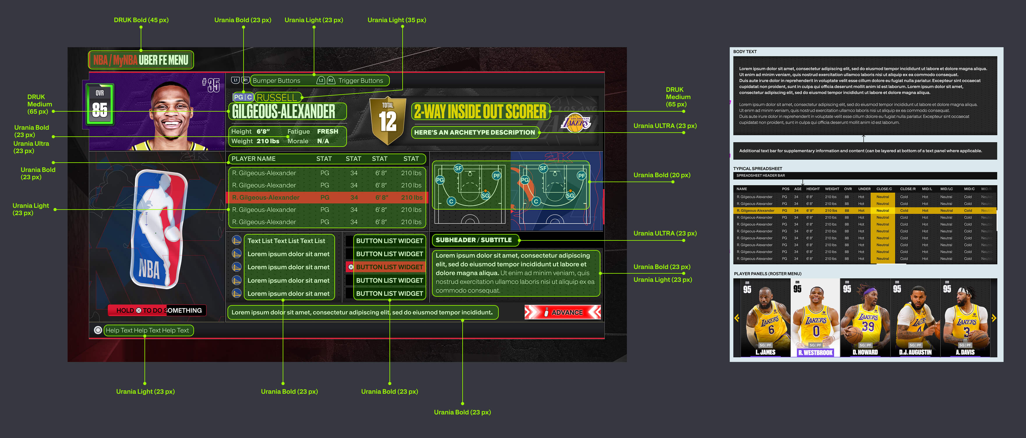
Slice of the StyleGuide: sample showing all possible font variations
For color, I gave each product area its own accent for navigation and stripped everything else back. Panels got quieter, but on screens where navigation wasn't the main event I let them breathe. I wasn't going for minimalism, I just wanted color doing a job instead of filling space.

Before color standardization. Every screen made its own choices.
Three Tier Token Architecture
The design system uses a three tier token structure to manage visual consistency across game modes. Designers build a component once and it adapts everywhere. No duplicating work per mode, no hard coded colors breaking when things change.
Tier 1: Primitive Tokens
The raw values. Each game mode has its own highlight color. Designed in Figma and set in a JSON file.
MyCAREER
#00FFCC
MyNBA
#F2FB00
MyTEAM
#41FDFE
MyWNBA
#FF6B3B
Tier 2: Semantic Tokens
Dynamic references that resolve to the correct primitive based on context. A single token like highlight-gamemode.color automatically maps to the right color depending on which mode the user is in.
Tier 3: Component Tokens
Apply semantic tokens to specific UI elements. A settings button's selected state pulls from the semantic token, so the same component works across all modes without any manual overrides. This also works in full screen motion pieces and backgrounds.
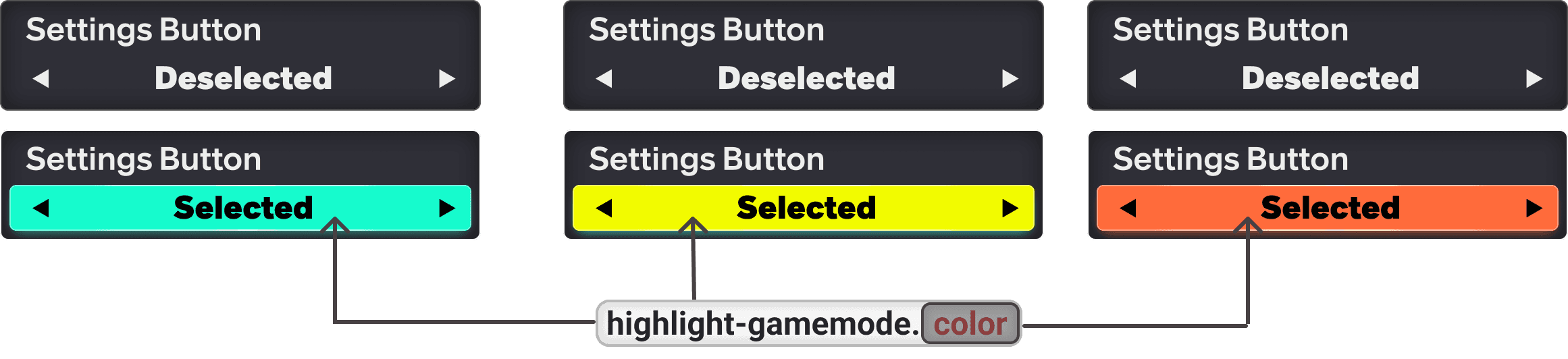
Change a primitive, and it cascades through every component.
02 - The System
Constraints that forced clarity
I limited screens to three font variations. It was a tough sell on dense menus, but the constraint forced prioritization. When everything is loud, nothing is loud.
3 Font Variations
Constraint
Slice of the StyleGuide: sample showing all possible font variations
For color, I gave each product area its own accent for navigation and stripped everything else back. Panels got quieter, but on screens where navigation wasn't the main event I let them breathe. I wasn't going for minimalism, I just wanted color doing a job instead of filling space.
Before color standardization. Every screen made its own choices.
Three Tier Token Architecture
The design system uses a three tier token structure to manage visual consistency across game modes. Designers build a component once and it adapts everywhere. No duplicating work per mode, no hard coded colors breaking when things change.
Tier 1: Primitive Tokens
The raw values. Each game mode has its own highlight color. Designed in Figma and set in a JSON file.
MyCAREER
#00FFCC
MyNBA
#F2FB00
MyTEAM
#41FDFE
MyWNBA
#FF6B3B
Tier 2: Semantic Tokens
Dynamic references that resolve to the correct primitive based on context. A single token like highlight-gamemode.color automatically maps to the right color depending on which mode the user is in.
Tier 3: Component Tokens
Apply semantic tokens to specific UI elements. A settings button's selected state pulls from the semantic token, so the same component works across all modes without any manual overrides. This also works in full screen motion pieces and backgrounds.
Change a primitive, and it cascades through every component.
03 - Components
The ~40 building blocks
I consolidated the library from 500+ down to about 40 over multiple releases. Started with high frequency stuff like buttons and panels, then cleanup passes after each release. I built flexible components that could transform into different configurations but only needed one update when we changed the look.
Panel Component A - Generic Panel

Team Color (dynamic)
Stroke
Pattern
Bar Right
Bar Left
Bar Top
Bar Bottom
Inner Shadow Bottom
Inner Shadow Top

Team Colored
Stroke
Pattern
Bar Right
Bar Left
Bar Top
Bar Bottom
Inner Shadow Bottom
Inner Shadow Top
Panel Component B - Decorative Panel

Game Mode (dynamic)
Stroke
Pattern
Bar Right
Bar Left
Bar Top
Bar Bottom
Inner Shadow Bottom
Inner Shadow Top

Game Mode (dynamic)
Stroke
Pattern
Bar Right
Bar Left
Bar Top
Bar Bottom
Inner Shadow Bottom
Inner Shadow Top
Panel System
Primary and secondary containers with configurable shadows, strokes, pattern textures, and team color overlays.
Foundation

MyTEAM Trading Cards
A layered card system where producers and artists could swap images, textures, and effects to build their own trading cards. Designed to feel premium, like you could pull them out of the screen and touch them. Made the pack market more attractive and drove engagement with card collecting.
Composite

Navigation Tabs
Two state component. Solid fill for selected, transparent for deselected. Combined with controller prompts, users cycle views with a single input.
Atom
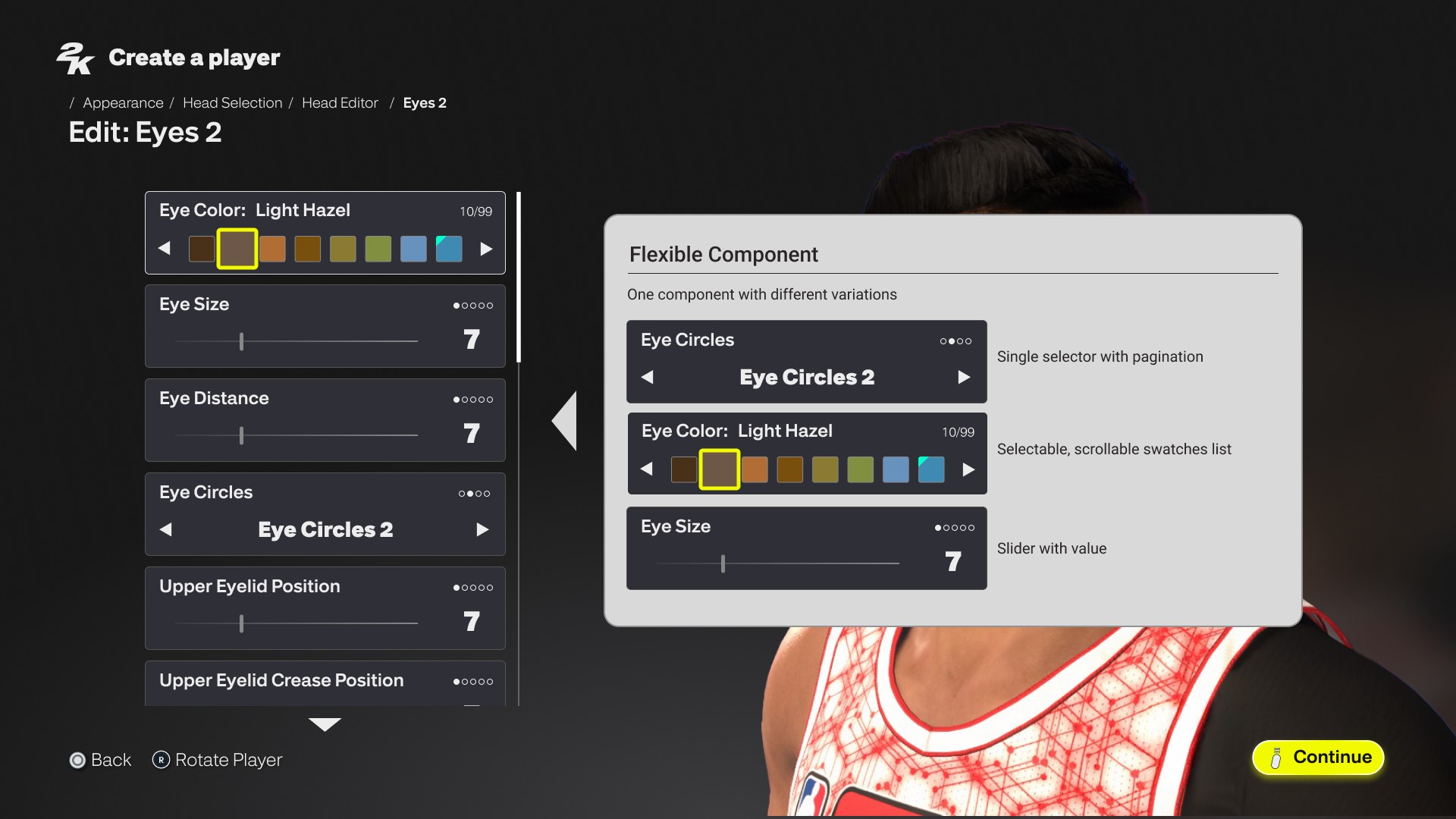
One component, multiple configurations through exposed properties


03 - Components
The ~40 building blocks
I consolidated the library from 500+ down to about 40 over multiple releases. Started with high frequency stuff like buttons and panels, then cleanup passes after each release. I built flexible components that could transform into different configurations but only needed one update when we changed the look.
Panel Component A - Generic Panel
Team Color (dynamic)
Stroke
Pattern
Bar Right
Bar Left
Bar Top
Bar Bottom
Inner Shadow Bottom
Inner Shadow Top
Team Colored
Stroke
Pattern
Bar Right
Bar Left
Bar Top
Bar Bottom
Inner Shadow Bottom
Inner Shadow Top
Panel Component B - Decorative Panel
Game Mode (dynamic)
Stroke
Pattern
Bar Right
Bar Left
Bar Top
Bar Bottom
Inner Shadow Bottom
Inner Shadow Top
Game Mode (dynamic)
Stroke
Pattern
Bar Right
Bar Left
Bar Top
Bar Bottom
Inner Shadow Bottom
Inner Shadow Top
Panel System
Primary and secondary containers with configurable shadows, strokes, pattern textures, and team color overlays.
Foundation
MyTEAM Trading Cards
A layered card system where producers and artists could swap images, textures, and effects to build their own trading cards. Designed to feel premium, like you could pull them out of the screen and touch them. Made the pack market more attractive and drove engagement with card collecting.
Composite
Navigation Tabs
Two state component. Solid fill for selected, transparent for deselected. Combined with controller prompts, users cycle views with a single input.
Atom
One component, multiple configurations through exposed properties
04 - States
Every element declares its state
I designed how components moved and responded to input, not just how they looked. The accent color changes per game mode, but the rules stay consistent. When a button triggers an action or navigates to another screen, it highlights in the mode's accent color. When something is just selected or toggled, like a tab or a menu option, it highlights in white. That separation made the UI readable across every mode without anyone having to think about which color to use where.
Beyond color, components carried animation and effects as part of their design. Transitions, particle layers, and motion behaviors were built into the components themselves so the system didn't just look consistent, it felt consistent in motion.
05 - Theming
One system, many identities
Panels swapped textures per game mode. Text color shifted based on the active theme. The background itself was a big component that changed shape, color, and texture depending on the mode and what that year's visual direction called for. Seasonal content plugged into the same token setup so limited time events could go out without custom builds.


" height="260.325px" id="TkjbKgTxx" transform="translate(251.677 0)" width="308.64599999999996px"/><path d="M 41.36 0 L 4.878 56.798 L 0 87.181 L 27.631 87.181 L 35.541 48.863 L 71.29 0.487 Z" fill="rgb(255, 255, 255)" height="87.18099999999998px" id="kWqoSzZmT" transform="translate(78.747 317.819)" width="71.29px"/><path d="M 97.458 0 L 72.754 0 L 54.008 37.657 L 41.151 0 L 13.833 0 L 0 80.256 L 26.237 80.116 L 32.265 39.641 L 44.112 70.859 L 60.14 70.963 L 78.189 38.666 L 82.754 76.88 L 103.939 44.096 Z" fill="rgb(255, 255, 255)" height="80.25600000000003px" id="HsYw0gMyh" transform="translate(0 285.104)" width="103.939px"/><path d="M 81.848 86.973 L 35.018 86.973 L 35.018 75.244 L 77.388 75.244 L 77.388 44.13 L 35.018 44.13 L 35.018 32.715 L 80.559 32.715 L 80.559 0 L 0 0 L 0 119.896 L 81.848 119.896 Z" fill="rgb(255, 255, 255)" height="119.89600000000002px" id="mO4qgUsL2" transform="translate(606.84 285.104)" width="81.84799999999996px"/><path d="M 42.614 81.299 L 43.416 81.299 L 62.475 119.93 L 112.685 119.93 L 79.305 73.677 L 79.305 72.737 C 88.469 69.675 94.671 65.916 98.364 59.965 C 101.187 55.371 102.511 49.489 102.511 41.589 C 102.511 11.415 79.618 0 52.614 0 L 0 0 L 0 119.895 L 42.579 119.895 L 42.579 81.264 Z M 42.614 32.714 L 45.959 32.714 C 53.416 32.714 59.931 33.828 59.931 43.016 C 59.931 52.204 52.789 53.004 45.646 53.004 L 42.614 53.004 L 42.614 32.679 Z" fill="rgb(255, 255, 255)" height="119.93px" id="frPGFMVX0" transform="translate(699.315 285.07)" width="112.68499999999995px"/><path d="M 81.848 86.973 L 35.053 86.973 L 35.053 75.244 L 77.388 75.244 L 77.388 44.13 L 35.053 44.13 L 35.053 32.715 L 80.594 32.715 L 80.594 0 L 0 0 L 0 119.896 L 81.848 119.896 Z" fill="rgb(255, 255, 255)" height="119.89600000000002px" id="tPunnavaV" transform="translate(514.434 285.104)" width="81.84800000000007px"/><path d="M 46.099 119.896 L 63.346 59.931 L 65.298 53.075 L 66.9 53.075 L 68.921 59.931 L 86.448 119.896 L 132.546 119.896 L 89.793 0 L 41.639 0 L 0 119.896 Z" fill="rgb(255, 255, 255)" height="119.89600000000002px" id="Du5NmlEJp" transform="translate(257.6 285.104)" width="132.546px"/><path d="M 42.614 81.299 L 43.416 81.299 L 62.475 119.93 L 112.685 119.93 L 79.305 73.677 L 79.305 72.737 C 88.469 69.675 94.671 65.916 98.365 59.965 C 101.187 55.371 102.511 49.489 102.511 41.589 C 102.511 11.415 79.619 0 52.615 0 L 0 0 L 0 119.895 L 42.58 119.895 L 42.58 81.264 Z M 42.614 32.714 L 45.959 32.714 C 53.416 32.714 59.932 33.828 59.932 43.016 C 59.932 52.204 52.789 53.004 45.646 53.004 L 42.614 53.004 L 42.614 32.679 Z" fill="rgb(255, 255, 255)" height="119.93px" id="tzB9HxFHn" transform="translate(394.745 285.07)" width="112.685px"/><path d="M 41.011 32.924 L 91.117 32.924 L 101.848 0 L 0 0 L 0 119.896 L 85.298 119.896 L 96.343 87.042 L 41.011 87.042 Z" fill="rgb(255, 255, 255)" height="119.89600000000002px" id="wEAi3Z1le" transform="translate(162.407 285.104)" width="101.84799999999998px"/><path d="M 122.546 0 L 90.943 63.097 L 69.339 0 L 23.276 0 L 0 137.018 L 44.182 137.018 L 54.357 66.439 L 74.322 118.747 L 101.291 118.921 L 122.546 79.106 Z" fill="rgb(255, 255, 255)" height="137.01839999999999px" id="iDr9_d3vj" transform="translate(285.475 33.063)" width="122.54599999999999px"/><path d="M 46.9 37.657 L 104.148 37.657 L 116.413 0 L 0 0 L 0 137.018 L 97.493 137.018 L 110.106 99.466 L 46.9 99.466 Z" fill="rgb(255, 255, 255)" height="137.01839999999999px" id="jwv3YdxcZ" transform="translate(415.617 33.063)" width="116.41299999999995px"/></svg>)
MyCAREER
Teal accent, urban textures, player focused panels. Background shifts to match your neighborhood and season.


" height="110.52299999999997px" id="x8rVO0Krw" transform="translate(0 420.737)" width="95.743px"/><path d="M 0 0.037 L 40.171 0.037 L 40.171 75.064 L 73.9 75.064 L 73.9 110.523 L 0 110.523 L 0 0 Z" fill="rgb(255, 255, 255)" height="110.52299999999997px" id="NOiwNRKjh" transform="translate(102.481 420.7)" width="73.9px"/><path d="M 42.503 110.523 L 0 110.523 L 38.394 0 L 82.822 0 L 122.252 110.523 L 79.749 110.523 L 76.084 96.754 L 45.724 96.754 Z M 69.049 70.511 L 64.347 51.005 C 63.162 46.304 62.459 41.492 61.719 36.792 L 60.238 36.792 L 52.907 70.511 Z" fill="rgb(255, 255, 255)" height="110.52299999999997px" id="Es1RdVJ37" transform="translate(182.822 420.737)" width="122.25200000000001px"/><path d="M 45.391 0 L 57.72 28.871 L 58.904 28.871 C 60.089 25.354 61.089 21.838 62.57 18.47 L 70.493 0 L 115.661 0 L 77.823 62.886 L 77.823 110.523 L 38.541 110.523 L 38.541 62.886 L 0 0 L 45.465 0 Z" fill="rgb(255, 255, 255)" height="110.52299999999997px" id="nBwI10laJ" transform="translate(277.048 420.737)" width="115.661px"/><path d="M 76.491 0 L 114.921 0 L 114.921 110.523 L 76.491 110.523 L 35.098 46.748 L 33.913 46.748 L 34.765 110.523 L 0 110.523 L 0 0 L 42.614 0 L 75.491 56.002 L 76.676 56.002 Z" fill="rgb(255, 255, 255)" height="110.52299999999997px" id="uBwI0w_RD" transform="translate(406.963 420.737)" width="114.92099999999999px"/><path d="M 122.252 57.298 C 122.252 92.757 94.817 114.003 61.126 114.003 C 27.435 114.003 0 92.757 0 57.298 C 0 21.838 27.546 0 61.126 0 C 94.706 0 122.252 22.579 122.252 57.298 Z M 40.43 57.89 C 40.43 70.512 48.945 79.136 61.089 79.136 C 73.233 79.136 81.748 70.475 81.748 57.89 C 81.748 46.156 73.825 36.348 61.089 36.348 C 48.353 36.348 40.43 46.156 40.43 57.89 Z" fill="rgb(255, 255, 255)" height="114.00299999999999px" id="kOJbS1md3" transform="translate(529.955 418.997)" width="122.25199999999995px"/><path d="M 41.614 0 L 55.535 65.959 L 56.423 65.959 C 57.164 59.222 58.053 52.189 59.793 45.601 L 71.529 0.037 L 102.296 0.037 L 117.401 65.996 L 118.29 65.996 C 118.882 59.555 119.623 52.819 121.067 46.489 L 132.211 0.037 L 169.938 0.037 L 135.025 110.56 L 100 110.56 L 87.375 50.487 L 86.042 50.487 C 85.598 56.187 85.302 61.776 84.006 67.18 L 72.862 110.56 L 38.689 110.56 L 0 0.037 L 41.651 0.037 Z" fill="rgb(255, 255, 255)" height="110.56px" id="pwMs3KmA7" transform="translate(645.062 420.737)" width="169.938px"/><path d="M 128.101 0 L 39.282 0 C 17.623 0 0 17.619 0 39.272 L 0 340.01 C 0 361.663 17.586 379.318 39.282 379.318 L 128.064 379.318 C 149.723 379.318 167.42 361.663 167.42 340.01 L 167.42 39.272 C 167.42 17.619 149.797 0 128.138 0" fill="rgb(255, 255, 255)" height="379.318px" id="eM5jBxYY2" transform="translate(323.809 0)" width="167.41999999999996px"/><path d="M 10.516 60.296 L 10.59 61.591 C 13.293 63.183 14.663 64.441 17.403 66.218 C 24.659 70.771 33.582 78.877 32.434 106.786 C 34.47 112.893 35.359 124.848 37.247 128.698 C 41.024 136.175 43.541 141.023 44.652 148.093 C 44.652 148.093 45.726 159.086 47.17 159.863 C 54.648 161.566 52.501 162.306 53.575 163.565 C 54.722 165.082 59.054 165.008 59.054 169.043 C 60.572 171.042 61.646 173.151 62.497 175.298 L 62.497 30.018 C 62.497 13.473 49.021 0 32.508 0 L 3.815 0 C 8.443 1.629 11.035 3.553 12.552 6.626 C 16.255 6.959 20.661 15.25 13.811 27.501 C 16.847 29.537 14.478 32.535 12.293 36.052 C 11.664 37.162 10.96 39.161 8.924 39.05 C 6.332 44.528 3.148 49.858 0.779 50.191 C 0.076 51.079 -0.48 53.448 0.631 54.558 C 4.111 56.113 8.369 58.26 10.479 60.259" fill="rgb(217, 26, 50)" height="175.29753px" id="MCKRpc2JM" transform="translate(419.365 9.253)" width="62.496621951609825px"/><path d="M 70.53 94.976 C 66.643 104.858 56.943 111.817 45.613 111.817 C 30.804 111.817 18.845 99.824 18.845 85.056 C 18.845 72.434 27.509 61.848 39.319 59.035 C 36.246 51.336 29.73 38.789 27.768 34.68 C 25.954 30.608 21.511 5.143 20.585 0.109 C 20.363 -1.001 9.034 6.698 9.034 7.142 C 8.368 7.771 0.519 28.24 0.185 29.35 C 0.037 30.053 0 32.792 0 32.792 C 0 32.792 3.851 33.273 6.072 39.973 C 8.257 46.673 14.958 71.213 14.958 71.213 C 14.958 71.213 13.144 73.1 13.07 72.989 C 21.511 101.268 18.586 113.483 22.363 121.774 C 27.139 133.47 28.434 131.952 32.507 141.761 C 35.432 148.905 38.727 177.109 39.801 178.331 C 44.355 184.105 46.835 188.621 46.835 191.915 C 46.835 195.209 42.985 204.907 44.392 210.57 C 45.243 213.901 45.687 221.341 47.242 222.748 C 47.242 222.748 48.649 225.561 47.946 226.782 C 47.761 227.226 47.353 227.855 47.539 228.374 C 50.056 237.257 58.164 252.396 45.021 260.354 L 45.317 260.354 C 59.682 258.133 70.567 245.807 70.567 230.669 L 70.567 94.902 Z" fill="rgb(217, 26, 50)" height="260.35431093590535px" id="P0WlTNxAs" transform="translate(411.369 109.267)" width="70.56699999999995px"/><path d="M 115.144 325.019 C 110.331 320.726 113.552 318.912 113.367 317.209 C 110.183 304.07 99.742 296.112 105.147 291.781 C 103.815 287.45 101.112 282.009 101.186 282.009 C 84.933 272.682 71.086 257.506 68.716 255.285 C 65.865 252.176 61.015 249.067 60.09 246.55 C 56.165 242.96 37.024 215.754 32.544 205.761 L 24.769 204.65 C 21.215 190.178 9.404 178.074 9.108 163.565 C 8.997 158.087 11.589 146.353 12.551 144.021 C 13.514 141.653 18.031 137.729 18.031 137.729 L 18.031 133.843 C 1.037 134.324 5.924 132.584 2.999 125.996 C 0.963 121.443 2.407 120.407 3.147 117.26 C 5.443 107.896 12.996 93.498 16.106 86.946 C 17.068 83.651 20.326 75.656 20.326 75.656 C 32.988 49.895 37.69 51.782 52.722 50.339 L 53.462 49.265 C 68.531 48.599 66.05 47.489 68.161 32.979 C 65.976 33.942 65.31 28.427 65.31 28.427 C 64.125 20.173 67.605 21.727 69.234 21.579 C 69.568 7.995 70.975 3.738 80.749 0 L 30.027 0 C 13.44 0 0 13.436 0 30.018 L 0 330.757 C 0 347.339 13.44 360.812 30.027 360.812 L 118.846 360.812 C 108.665 355.334 114.662 344.859 115.033 325.019" fill="rgb(0, 66, 139)" height="360.81154000000004px" id="xgXpcvyWt" transform="translate(332.953 9.216)" width="118.846px"/></g></svg>)
PLAYNOW
Yellow accent, clean data heavy layouts. Same panels and components, different personality through tokens.


" height="80.755px" id="Y6wa73EPC" transform="translate(72.969 324.245)" width="66.05919999999999px"/><path d="M 90.307 0 L 67.415 0 L 50.045 34.881 L 38.131 0 L 12.818 0 L 0 74.339 L 24.312 74.21 L 29.898 36.718 L 40.876 65.603 L 55.727 65.7 L 72.452 35.783 L 76.682 71.18 L 96.312 40.812 Z" fill="rgb(255, 255, 255)" height="74.339px" id="SY2K7PaM0" transform="translate(0 293.942)" width="96.3124px"/><path d="M 0 0 L 0 34.687 L 35.451 34.687 L 35.451 111.058 L 67.674 111.058 L 67.674 34.687 L 100.607 34.687 L 100.607 34.655 L 111.972 0 Z" fill="rgb(255, 255, 255)" height="111.05799999999999px" id="CZyJlW6nQ" transform="translate(150.49 293.942)" width="111.97199999999998px"/><path d="M 38.648 0 L 0 111.058 L 42.781 111.058 L 46.042 97.196 L 76.585 97.196 L 80.266 111.058 L 123.047 111.058 L 118.808 99.194 L 83.366 0 Z M 53.242 70.858 L 60.603 36.976 L 62.089 36.976 C 62.831 41.683 63.574 46.551 64.736 51.257 L 69.45 70.858 L 53.21 70.858 Z" fill="rgb(255, 255, 255)" height="111.05799999999999px" id="kvC0X4XdM" transform="translate(345.762 293.942)" width="123.04700000000003px"/><path d="M 32.513 69.794 L 71.839 69.794 L 71.839 40.941 L 32.513 40.941 L 32.513 30.335 L 74.777 30.335 L 74.777 0 L 0 0 L 0 111.058 L 74.196 111.058 L 84.786 80.69 L 32.513 80.69 Z" fill="rgb(255, 255, 255)" height="111.05799999999999px" id="wOVK6gRYb" transform="translate(262.623 293.942)" width="84.786px"/><path d="M 134.582 0 L 97.613 0 L 71.912 51.193 L 54.348 0 L 16.927 0 L 0 99.194 L 4.239 111.058 L 33.91 111.058 L 42.176 54.707 L 58.416 96.39 L 80.275 96.519 L 105.039 53.353 L 110.108 111.058 L 145.43 111.058 Z" fill="rgb(255, 255, 255)" height="111.05799999999999px" id="w4M7mVF0b" transform="translate(464.57 293.942)" width="145.43px"/><path d="M 301.884 224.47 L 301.884 26.628 L 150.942 0 L 0 26.628 L 0 224.47 L 150.942 255.224 Z" fill="rgb(128, 117, 255)" height="255.224px" id="oHXxQ6jOT" transform="translate(152.589 0)" width="301.884px"/><path d="M 0 0 L 3.874 39.653 L 40.423 39.653 L 40.423 126.92 L 77.263 126.92 L 77.263 39.653 L 106.063 39.62 L 119.042 0 Z" fill="rgb(255, 255, 255)" height="126.9196px" id="lVvHyacuZ" transform="translate(326.455 61.67)" width="119.04200000000003px"/><path d="M 113.812 0 L 84.463 58.544 L 64.38 0 L 21.6 0 L 0 126.92 L 41.037 126.92 L 50.497 62.541 L 69.029 110.188 L 94.052 110.317 L 122.335 60.962 L 128.147 126.92 L 168.506 126.92 L 156.108 0 Z" fill="rgb(255, 255, 255)" height="126.9196px" id="Zs5xq4sgc" transform="translate(161.565 61.67)" width="168.50600000000003px"/></svg>)
MyTEAM
Blue accent, card collection aesthetic. The system adapts to a marketplace context while staying on the same component set.


" width="323.165px"><g d="M 0 300.118 L 0 0.118 L 323.165 0.118 L 323.165 300.118 Z M 38.408 286.155 L 36.169 300.118 L 48.871 300.118 L 52.503 282.504 L 68.912 260.261 L 55.175 260.035 Z M 47.742 265.266 L 44.769 244.98 L 33.421 244.98 L 24.802 262.312 L 18.912 244.98 L 6.342 244.98 L 0 281.902 L 12.044 281.826 L 14.829 263.215 L 20.267 277.573 L 27.625 277.611 L 35.924 262.764 L 38.013 280.34 Z M 187.58 261.315 C 187.58 266.245 188.012 271.062 188.878 275.767 C 187.561 272.718 185.622 269.199 183.063 265.191 L 170.21 244.999 L 149.887 244.999 L 149.887 300.136 L 167.952 300.136 L 167.952 273.433 C 167.952 270.949 167.501 267.939 166.616 264.382 C 168.592 268.842 170.549 272.643 172.487 275.767 L 187.58 300.136 L 205.382 300.136 L 205.382 244.999 L 187.58 244.999 Z M 281.332 244.98 L 262.175 300.118 L 283.383 300.118 L 284.983 293.249 L 300.112 293.249 L 301.938 300.118 L 323.146 300.118 L 303.481 244.98 Z M 288.577 280.152 L 292.228 263.328 L 292.962 263.328 C 293.319 265.662 293.695 268.089 294.279 270.423 L 296.612 280.152 Z M 249.491 271.476 C 252.559 270.648 254.873 269.105 256.417 266.885 C 257.96 264.664 258.731 262.18 258.731 259.433 C 258.731 255.669 257.395 252.319 254.742 249.384 C 252.07 246.448 247.835 244.98 242.021 244.98 L 214.038 244.98 L 214.038 300.118 L 240.289 300.118 C 248.532 300.118 253.914 298.518 256.417 295.281 C 258.938 292.063 260.199 288.413 260.199 284.31 C 260.199 277.479 256.624 273.189 249.491 271.458 Z M 233.345 287.397 L 231.953 287.397 L 231.953 278.044 L 233.477 278.044 C 236.902 278.044 239.894 278.552 239.894 282.786 C 239.894 287.02 236.62 287.378 233.327 287.378 Z M 233.345 266.17 L 231.953 266.17 L 231.953 256.817 L 233.477 256.817 C 236.902 256.817 239.894 257.325 239.894 261.559 C 239.894 265.793 236.62 266.151 233.327 266.151 Z M 121.452 272.888 L 113.323 251.454 L 101.787 251.454 L 93.658 272.888 L 89.518 245.093 L 71.509 244.98 L 80.993 300.118 L 99.755 300.118 L 107.564 277.216 L 115.355 300.118 L 134.117 300.118 L 143.601 244.98 L 125.611 245.093 Z M 96.142 215.869 C 96.331 215.643 96.519 215.418 96.368 215.041 C 96.312 214.891 96.5 214.627 96.594 214.439 C 96.97 213.762 97.384 213.122 97.723 212.444 C 97.723 212.444 97.723 212.407 97.742 212.388 C 97.874 212.124 97.855 211.786 97.892 211.485 C 97.968 210.751 98.043 210.657 98.814 210.562 C 99.172 209.452 99.774 208.455 100.339 207.439 C 100.941 206.366 101.336 205.143 101.694 203.957 C 101.788 203.637 107.283 191.311 107.716 190.163 C 108.299 188.583 113.643 171.326 113.982 169.99 C 114.34 168.598 113.794 165.361 115.036 162.934 C 115.318 162.388 118.329 158.699 119.063 157.533 C 119.42 156.949 122.563 151.737 122.883 151.21 C 123.09 150.89 125.612 146.091 125.649 145.922 C 124.426 145.602 123.165 145.301 122.093 144.473 C 122.601 144.04 128.378 138.338 129.563 137.209 C 129.846 136.946 135.83 131.168 136.677 130.209 C 137.279 129.531 137.862 128.816 138.446 128.101 C 138.596 127.913 138.728 127.743 139.029 127.668 C 139.462 127.574 139.857 127.311 140.026 126.821 C 140.102 126.596 140.252 126.407 140.309 126.2 C 140.422 125.749 140.647 125.466 141.155 125.523 C 141.419 125.561 141.588 125.429 141.701 125.184 C 141.889 124.827 142.078 124.469 142.266 124.093 C 142.661 123.34 143.056 122.606 143.414 121.853 C 143.602 121.458 144.242 119.614 144.637 119.181 C 145.013 118.786 145.352 118.316 145.634 117.845 C 146.161 116.904 146.876 116.151 147.798 115.643 C 148.777 115.098 149.755 114.552 150.753 114.044 C 151.148 113.837 151.28 113.555 151.223 113.103 C 151.11 112.218 151.11 111.315 151.317 110.45 C 151.393 110.111 151.261 108.06 151.261 107.382 C 151.261 106.648 151.223 105.914 151.129 105.18 C 151.073 104.748 151.167 104.409 151.487 104.145 C 151.788 103.901 152.71 100.307 152.729 99.027 C 152.729 98.199 154.027 96.336 153.858 95.978 C 153.632 95.508 153.801 95.094 153.99 94.661 C 154.159 94.266 154.309 93.852 154.366 93.438 L 154.366 93.306 C 154.441 92.798 154.592 92.365 154.874 91.951 C 155.589 90.879 156.041 89.693 156.304 88.432 C 156.379 88.075 156.963 85.271 156.982 84.161 C 156.982 82.335 156.85 80.491 157.245 78.666 C 157.546 77.235 158.355 76.163 159.353 75.203 C 159.955 74.62 160.689 74.206 161.385 73.716 C 161.573 73.585 161.761 73.491 162.063 73.302 C 161.686 73.095 161.385 72.907 161.065 72.738 C 159.033 71.646 157.019 70.555 155.137 69.219 C 154.686 68.899 151.769 66.245 150.659 65.399 C 150.376 65.192 150.113 64.966 149.849 64.74 L 105.363 64.74 L 63.944 218.523 L 93.771 218.523 C 93.865 218.41 93.978 218.297 94.072 218.165 C 94.75 217.393 95.446 216.66 96.105 215.888 Z M 259.184 64.74 L 205.382 64.74 C 205.42 65.305 205.476 65.869 205.458 66.415 C 205.458 67.017 205.345 67.6 205.025 68.184 C 204.818 69.859 204.78 71.496 205.702 73.001 C 206.549 74.375 207.377 75.749 208.243 77.104 C 209.297 78.76 209.955 80.566 210.219 82.448 C 209.692 81.902 209.165 81.281 208.563 80.754 C 207.979 80.265 207.358 79.813 206.681 79.475 C 205.589 78.929 204.46 78.477 203.331 78.007 C 202.56 77.687 201.995 77.179 201.638 76.426 C 201.374 75.881 201.148 75.297 200.847 74.77 C 200.621 74.375 200.527 73.999 200.508 73.547 C 200.508 73.208 200.377 72.851 200.283 72.531 C 200.094 71.853 199.737 71.176 199.718 70.498 C 199.643 68.955 199.963 67.469 200.584 66.057 C 200.659 65.888 200.734 65.737 200.81 65.568 C 200.941 65.323 200.998 65.022 201.035 64.759 L 199.059 64.759 C 198.965 64.872 198.852 64.985 198.721 65.079 C 198.382 65.342 198.024 65.606 197.648 65.85 C 197.084 66.227 196.481 66.603 195.879 66.998 C 196.011 67.732 196.086 68.522 196.274 69.294 C 196.557 70.404 196.594 71.515 196.538 72.625 C 196.425 74.808 196.256 77.009 196.049 79.193 C 195.917 80.604 195.54 81.959 194.769 83.163 C 194.035 84.311 193.489 85.534 193.282 86.908 C 193.188 87.567 192.944 88.15 192.435 88.658 C 192.097 88.978 191.871 89.448 191.645 89.881 C 191.626 89.919 191.607 89.956 191.589 90.013 C 191.325 90.54 191.137 91.086 190.949 91.65 C 190.817 92.083 190.629 93.607 190.497 93.871 C 190.271 94.322 189.951 94.736 189.707 95.188 C 189.406 95.734 188.86 97.145 188.898 97.258 C 189.048 97.785 188.822 98.199 188.521 98.594 C 188.333 98.839 187.938 99.911 188.051 100.099 C 188.709 101.172 188.427 102.32 188.39 103.43 C 187.976 103.543 187.204 109.64 185.868 110.807 C 185.623 111.033 185.567 111.24 185.68 111.541 C 186.018 112.557 186.037 113.592 185.868 114.646 C 185.736 115.436 185.868 116.17 186.225 116.885 C 187.091 116.998 187.599 117.563 187.957 118.278 C 188.201 118.767 189.029 122.154 189.236 123.302 C 189.349 123.905 189.33 126.238 189.105 126.69 C 188.747 127.348 188.22 127.932 187.881 128.383 C 187.769 128.929 187.769 129.343 187.599 129.682 C 187.016 130.848 187.129 131.996 187.599 133.144 C 187.881 133.822 188.164 134.462 188.126 135.195 C 188.032 136.833 187.957 138.47 187.75 140.088 C 187.58 141.311 187.656 142.478 187.938 143.645 C 188.088 144.285 188.408 147.22 188.465 148.048 C 188.559 149.422 189.33 155.519 189.33 155.689 C 189.312 156.272 189.537 160.13 189.744 160.788 C 190.046 161.014 191.589 162.689 192.36 163.705 C 192.605 164.006 195.296 166.02 196.877 170.348 C 197.554 172.173 197.799 174.055 198.119 175.937 C 198.363 177.367 198.533 178.816 198.947 180.209 C 199.266 181.3 203.802 195.658 203.971 196.505 C 204.103 197.107 205.476 199.403 206.248 199.253 C 206.982 199.93 207.434 201.605 207.716 202.565 C 207.923 203.317 208.092 204.089 208.224 204.879 C 208.525 206.535 208.883 208.135 210.068 209.415 C 210.219 209.584 210.35 209.772 210.463 209.979 C 210.67 210.355 213.474 215.342 214.923 217.055 C 215.111 217.281 215.318 217.525 215.525 217.751 C 215.77 218.033 216.015 218.334 216.241 218.617 L 217.784 218.617 L 259.202 64.834 Z M 197.046 214.608 C 196.707 214.326 195.691 213.329 195.503 213.103 C 194.656 212.049 194.769 210.619 194.75 209.358 C 194.75 207.928 194.788 206.498 194.543 205.086 C 194.449 204.522 194.505 203.92 194.468 203.336 C 194.468 202.922 195.785 202.489 195.691 202.094 C 195.277 200.325 192.097 194.623 191.871 194.322 C 191.495 193.814 187.26 186.155 185.924 184.386 C 185.134 183.351 184.438 182.26 183.911 181.055 C 183.271 179.588 182.631 178.101 181.973 176.633 C 181.822 176.294 180.9 174.789 180.524 174.488 C 179.018 173.302 177.757 170.028 177.569 169.802 C 177.023 169.181 169.233 153.205 169.063 152.885 C 168.216 151.21 166.899 149.855 165.902 148.293 C 165.827 148.199 163.512 145.451 162.759 144.492 C 162.176 144.774 155.815 147.503 155.194 147.898 C 154.648 148.236 154.065 148.5 153.463 148.726 C 151.826 149.384 148.909 151.699 148.815 151.793 C 146.331 154.296 143.583 156.517 141.269 159.189 C 139.97 160.675 138.408 161.955 136.978 163.329 C 136.131 164.138 135.285 164.966 134.419 165.756 C 134.155 166.001 131.916 168.861 131.295 169.501 C 130.298 170.555 129.357 171.665 128.378 172.757 C 127.682 173.528 127.23 174.431 126.854 175.391 C 126.177 177.141 124.521 180.999 124.408 181.206 C 123.881 182.166 123.297 184.462 123.26 184.556 C 122.959 185.402 122.789 189.185 118.066 194.021 C 117.577 194.529 116.974 194.962 116.579 195.545 C 115.375 197.352 110.539 205.331 110.313 206.573 C 109.391 208.361 108.92 210.355 108.619 211.108 C 108.977 211.466 109.297 211.767 109.579 212.068 C 109.504 212.407 109.41 212.708 109.391 213.009 L 109.391 213.329 C 109.391 213.479 109.428 213.63 109.485 213.762 C 109.974 214.853 110.501 215.926 110.99 217.017 C 111.122 217.299 111.16 217.6 111.273 217.883 C 111.348 218.09 111.404 218.297 111.461 218.504 L 201.487 218.504 C 201.186 217.996 200.866 217.506 200.546 217.205 C 199.492 216.208 198.119 215.512 196.989 214.59 Z M 214.904 216.942 C 213.455 215.229 210.651 210.242 210.444 209.866 C 210.331 209.659 210.199 209.471 210.049 209.302 C 208.863 208.022 208.506 206.404 208.205 204.766 C 208.073 203.995 207.904 203.223 207.697 202.452 C 207.433 201.511 206.982 199.817 206.229 199.14 C 205.457 199.309 204.084 196.994 203.952 196.392 C 203.782 195.545 199.247 181.187 198.927 180.096 C 198.513 178.684 198.344 177.254 198.099 175.824 C 197.779 173.942 197.516 172.06 196.857 170.235 C 195.258 165.907 192.567 163.893 192.341 163.592 C 191.569 162.576 190.026 160.901 189.725 160.675 C 189.518 160.017 189.292 156.159 189.311 155.576 C 189.311 155.406 188.54 149.309 188.446 147.935 C 188.389 147.126 188.069 144.172 187.919 143.532 C 187.655 142.346 187.561 141.198 187.731 139.975 C 187.956 138.357 188.013 136.72 188.107 135.083 C 188.145 134.349 187.862 133.69 187.58 133.031 C 187.11 131.902 186.997 130.736 187.58 129.569 C 187.749 129.23 187.749 128.816 187.862 128.27 C 188.201 127.8 188.747 127.235 189.085 126.577 C 189.311 126.125 189.33 123.792 189.217 123.189 C 189.01 122.041 188.182 118.654 187.938 118.165 C 187.58 117.469 187.072 116.885 186.206 116.772 C 185.867 116.057 185.736 115.323 185.849 114.533 C 186.018 113.479 185.999 112.444 185.661 111.428 C 185.548 111.127 185.604 110.901 185.849 110.694 C 187.204 109.509 187.975 103.43 188.37 103.317 C 188.408 102.207 188.69 101.078 188.032 99.986 C 187.919 99.817 188.333 98.726 188.502 98.481 C 188.803 98.086 189.029 97.672 188.878 97.145 C 188.841 97.032 189.405 95.621 189.688 95.075 C 189.932 94.623 190.252 94.228 190.478 93.758 C 190.61 93.494 190.779 91.97 190.93 91.537 C 191.099 90.973 191.306 90.427 191.569 89.9 C 191.588 89.862 191.607 89.825 191.626 89.768 C 191.833 89.335 192.059 88.865 192.416 88.545 C 192.943 88.056 193.169 87.472 193.263 86.795 C 193.47 85.44 194.016 84.217 194.75 83.05 C 195.521 81.846 195.898 80.491 196.029 79.08 C 196.236 76.897 196.406 74.714 196.519 72.512 C 196.575 71.402 196.519 70.273 196.255 69.181 C 196.067 68.428 195.973 67.638 195.86 66.885 C 196.462 66.49 197.064 66.114 197.629 65.737 C 198.005 65.493 198.363 65.248 198.702 64.966 C 198.814 64.872 198.927 64.759 199.04 64.646 C 199.68 63.95 199.962 62.99 200.414 62.087 C 200.715 62.2 200.997 62.294 201.204 62.369 C 201.148 63.159 201.11 63.874 201.035 64.59 L 201.035 64.646 C 200.997 64.928 200.922 65.211 200.809 65.455 C 200.734 65.625 200.659 65.775 200.583 65.944 C 199.962 67.356 199.642 68.842 199.718 70.385 C 199.755 71.063 200.094 71.74 200.282 72.418 C 200.376 72.757 200.489 73.095 200.508 73.434 C 200.508 73.886 200.621 74.262 200.847 74.657 C 201.148 75.184 201.374 75.768 201.637 76.313 C 201.995 77.066 202.559 77.574 203.331 77.894 C 204.46 78.364 205.608 78.816 206.68 79.362 C 207.358 79.7 207.979 80.152 208.562 80.641 C 209.164 81.168 209.691 81.789 210.218 82.335 C 209.974 80.434 209.296 78.647 208.242 76.991 C 207.377 75.636 206.549 74.262 205.702 72.888 C 204.761 71.383 204.817 69.727 205.024 68.071 C 205.344 67.506 205.438 66.904 205.457 66.302 C 205.457 65.756 205.42 65.192 205.382 64.627 L 205.382 64.495 C 205.382 64.213 205.382 63.931 205.42 63.667 C 205.608 62.275 204.968 61.259 203.933 60.431 C 203.688 60.242 203.425 60.073 203.199 59.866 C 202.616 59.302 202.296 58.624 202.446 57.796 C 202.54 57.213 202.691 56.648 202.823 56.084 C 202.954 55.519 202.973 54.992 202.785 54.428 C 202.691 54.145 202.635 53.807 202.71 53.543 C 202.842 53.073 202.766 52.659 202.616 52.226 C 202.296 51.285 202.07 50.306 201.694 49.403 C 201.449 48.839 201.073 48.274 200.621 47.841 C 199.228 46.543 197.779 45.263 196.312 44.059 C 195.352 43.287 194.148 42.949 193 42.516 C 192.623 42.365 192.228 42.233 191.833 42.177 C 191.287 42.102 190.723 42.064 190.177 42.083 C 189.575 42.102 188.954 42.215 188.351 42.271 C 188.22 42.271 188.088 42.271 187.975 42.309 C 187.279 42.478 186.526 42.516 185.924 42.836 C 184.757 43.438 183.572 44.078 182.612 45.037 C 182.348 45.301 182.16 45.545 182.141 45.941 C 182.123 46.392 181.934 46.505 181.502 46.524 C 180.937 46.562 180.391 46.599 179.827 46.674 C 178.942 46.787 178.51 47.239 178.453 48.142 L 178.453 48.594 C 178.453 49.667 178.415 49.723 177.512 50.099 C 177.023 51.097 176.552 52.056 176.044 52.998 C 175.988 53.11 175.819 53.223 175.687 53.223 C 175.028 53.28 174.388 53.129 173.956 52.621 C 173.749 52.376 173.711 51.944 173.73 51.605 C 173.767 50.758 173.861 49.93 173.956 49.083 C 174.238 46.467 175.179 44.021 176.044 41.575 C 176.327 40.784 176.741 40.05 177.136 39.298 C 177.832 37.962 178.528 36.626 179.281 35.327 C 179.695 34.612 180.26 33.972 180.768 33.295 C 181.012 32.975 181.351 32.956 181.746 33.013 C 182.424 33.107 183.101 33.163 183.797 33.201 C 183.948 33.201 184.117 33.069 184.268 32.975 C 184.72 32.674 185.152 32.373 185.585 32.053 C 186.225 31.563 186.94 31.319 187.712 31.3 C 188.446 31.3 189.067 31.018 189.631 30.623 C 190.158 30.246 190.741 30.039 191.344 29.813 C 193.113 29.136 194.562 28.045 195.578 26.445 C 195.935 25.899 196.293 25.316 195.86 24.695 C 197.874 22.361 199.191 19.388 199.454 16.076 C 200.075 7.853 193.922 0.664 185.698 0.043 C 177.475 -0.578 170.286 5.576 169.665 13.799 C 169.307 18.41 171.095 22.7 174.2 25.692 C 174.144 27.198 175.48 28.571 175.48 28.571 C 175.894 28.967 175.856 29.042 175.48 29.437 C 174.953 29.964 174.426 30.472 173.937 31.037 C 173.165 31.921 172.412 32.787 171.716 33.746 C 170.531 35.384 169.195 36.889 167.896 38.432 C 164.565 42.384 161.987 46.806 159.823 51.492 C 159.371 52.47 159.202 53.487 159.334 54.541 C 159.39 54.955 159.466 55.35 159.522 55.745 C 159.56 56.027 159.578 56.328 159.616 56.742 C 158.694 56.46 157.885 56.234 157.094 55.971 C 156.492 55.764 155.871 55.557 155.326 55.256 C 154.14 54.635 153.444 53.712 153.688 52.282 C 153.82 51.454 153.971 50.626 154.027 49.779 C 154.159 47.766 154.215 45.752 154.385 43.739 C 154.479 42.591 154.629 41.443 154.949 40.352 C 155.495 38.47 156.21 36.644 156.85 34.781 C 157.301 33.483 157.791 32.184 158.242 30.886 C 158.75 29.437 159.503 28.176 160.595 27.085 C 161.799 25.88 162.89 24.563 163.963 23.227 C 164.979 21.966 165.506 20.31 166.974 19.557 C 167.162 19.463 167.651 19.125 167.802 18.993 C 168.461 18.278 167.539 17.845 166.579 17.996 C 166.447 18.014 165.751 18.259 165.619 18.316 C 164.829 18.617 164.151 19.275 163.549 19.934 C 163.116 20.404 161.78 21.477 161.385 21.402 C 159.315 21.063 158.694 19.313 159.56 17.6 C 160.218 14.815 161.272 12.632 161.761 10.393 C 162.044 9.095 160.839 8.756 160.087 9.509 C 159.955 9.791 158.619 13.028 158.073 14.326 C 157.734 15.116 157.791 14.891 157.396 15.662 C 157.132 16.17 156.887 16.246 156.304 15.926 C 156.342 15.53 156.361 15.116 156.398 14.702 C 156.662 12.708 157.339 8.097 156.586 7.42 C 156.172 7.006 155.852 6.874 155.288 7.401 C 154.592 8.963 154.667 10.657 154.027 12.275 C 153.557 10.958 153.895 9.509 152.992 8.304 C 152.522 7.928 152.108 7.702 151.618 8.568 C 151.618 8.812 151.863 10.111 151.863 11.165 C 151.863 11.579 151.844 12.143 151.355 12.331 C 151.054 12.444 150.847 14.439 150.828 14.684 C 150.753 15.831 150.847 16.979 151.073 18.109 C 151.505 20.442 152.014 21.891 152.164 24.281 C 152.164 24.525 152.239 24.789 152.315 25.034 C 152.597 26.012 152.465 26.953 152.183 27.894 C 151.317 30.66 150.226 33.314 149.059 35.948 C 147.949 38.451 146.82 40.935 145.86 43.494 C 144.976 45.865 144.26 48.293 143.545 50.702 C 142.981 52.621 142.68 54.578 142.567 56.592 C 142.492 57.871 143.282 58.662 144.091 59.433 C 144.562 59.885 145.145 60.242 145.597 60.713 C 145.954 61.089 146.33 61.466 146.726 61.842 C 147.742 62.821 148.833 63.743 149.944 64.627 C 150.207 64.853 150.47 65.079 150.753 65.286 C 151.863 66.133 154.78 68.786 155.231 69.106 C 157.094 70.442 159.127 71.533 161.159 72.625 C 161.46 72.794 161.761 72.964 162.157 73.189 C 161.855 73.378 161.667 73.472 161.479 73.603 C 160.802 74.093 160.049 74.525 159.447 75.09 C 158.449 76.05 157.64 77.141 157.339 78.553 C 156.944 80.378 157.094 82.222 157.076 84.048 C 157.076 85.158 156.473 87.962 156.398 88.319 C 156.135 89.58 155.683 90.766 154.968 91.838 C 154.686 92.252 154.535 92.704 154.46 93.193 L 154.46 93.325 C 154.422 93.739 154.253 94.153 154.084 94.548 C 153.895 94.981 153.726 95.395 153.952 95.865 C 154.121 96.242 152.842 98.086 152.823 98.914 C 152.804 100.194 151.863 103.788 151.581 104.032 C 151.28 104.296 151.186 104.635 151.223 105.067 C 151.317 105.801 151.355 106.535 151.355 107.269 C 151.355 107.947 151.487 109.998 151.411 110.337 C 151.204 111.221 151.204 112.105 151.317 112.99 C 151.374 113.423 151.242 113.724 150.847 113.931 C 149.849 114.458 148.871 114.985 147.892 115.53 C 146.951 116.057 146.255 116.791 145.728 117.732 C 145.465 118.221 145.107 118.673 144.731 119.068 C 144.336 119.501 143.677 121.345 143.508 121.74 C 143.15 122.493 142.736 123.227 142.36 123.98 C 142.172 124.337 141.965 124.695 141.795 125.071 C 141.682 125.297 141.513 125.429 141.25 125.41 C 140.741 125.354 140.516 125.617 140.403 126.087 C 140.346 126.313 140.196 126.501 140.12 126.708 C 139.97 127.198 139.556 127.461 139.123 127.555 C 138.822 127.631 138.709 127.8 138.54 127.988 C 137.956 128.684 137.373 129.399 136.771 130.096 C 135.924 131.055 129.94 136.833 129.657 137.096 C 128.472 138.225 122.676 143.927 122.187 144.36 C 123.278 145.188 124.52 145.489 125.743 145.809 C 125.706 145.978 123.184 150.777 122.977 151.097 C 122.657 151.624 119.533 156.836 119.157 157.42 C 118.423 158.605 115.393 162.294 115.13 162.821 C 113.907 165.229 114.434 168.485 114.076 169.877 C 113.737 171.213 108.412 188.47 107.81 190.051 C 107.377 191.198 101.882 203.524 101.788 203.844 C 101.43 205.03 101.035 206.234 100.433 207.326 C 99.868 208.342 99.266 209.339 98.909 210.449 C 98.137 210.544 98.062 210.638 97.986 211.372 C 97.949 211.673 97.986 212.011 97.836 212.275 C 97.836 212.275 97.836 212.312 97.817 212.331 C 97.478 213.009 97.064 213.667 96.688 214.326 C 96.575 214.514 96.387 214.778 96.462 214.928 C 96.613 215.305 96.424 215.53 96.236 215.756 C 95.578 216.528 94.881 217.28 94.204 218.033 C 94.11 218.146 93.997 218.259 93.903 218.391 C 93.47 218.88 93.037 219.388 92.661 219.915 C 91.927 220.95 91.005 221.853 90.497 223.039 C 90.478 223.076 89.405 225.071 88.239 226.031 C 87.956 226.257 85.04 228.797 84.87 229.08 C 84.306 230.039 82.217 232.053 81.746 233.088 C 81.502 233.652 81.897 235.835 84.531 236.437 C 87.072 237.134 88.972 236.513 89.782 236.343 C 92.115 235.854 94.166 234.819 95.973 233.182 C 97.384 231.902 98.57 230.378 100.169 229.287 C 100.395 229.136 101.618 228.44 101.712 228.402 C 103.161 227.819 104.592 227.254 106.041 226.671 C 107.151 226.219 108.28 225.805 109.334 225.259 C 110.03 224.902 110.651 224.394 111.291 223.942 C 111.441 223.829 112.044 223.227 112.1 223.058 C 112.364 222.324 112.495 220.423 112.213 219.953 C 111.931 219.482 111.761 218.918 111.611 218.372 C 111.554 218.165 111.479 217.958 111.423 217.751 C 111.329 217.469 111.272 217.149 111.14 216.885 C 110.651 215.794 110.124 214.721 109.635 213.63 C 109.578 213.498 109.56 213.347 109.541 213.197 L 109.541 212.877 C 109.56 212.576 109.654 212.275 109.729 211.936 C 109.428 211.635 109.127 211.334 108.769 210.976 C 109.07 210.224 109.522 208.248 110.463 206.441 C 110.708 205.199 115.544 197.22 116.729 195.414 C 117.106 194.83 117.708 194.398 118.216 193.889 C 122.939 189.072 123.109 185.271 123.41 184.424 C 123.447 184.33 124.031 182.034 124.558 181.074 C 124.671 180.867 126.327 177.009 127.004 175.259 C 127.38 174.3 127.832 173.396 128.528 172.625 C 129.507 171.533 130.429 170.423 131.445 169.369 C 132.066 168.729 134.306 165.869 134.569 165.624 C 135.435 164.815 136.282 164.006 137.128 163.197 C 138.577 161.823 140.12 160.544 141.419 159.057 C 143.734 156.385 146.5 154.164 148.965 151.661 C 149.059 151.567 151.976 149.253 153.613 148.594 C 154.196 148.349 154.799 148.105 155.344 147.766 C 155.984 147.371 162.326 144.623 162.909 144.36 C 163.643 145.32 165.977 148.067 166.052 148.161 C 167.049 149.723 168.385 151.078 169.213 152.753 C 169.383 153.092 177.173 169.068 177.719 169.67 C 177.907 169.896 179.168 173.152 180.674 174.356 C 181.05 174.657 181.972 176.163 182.123 176.501 C 182.781 177.969 183.421 179.456 184.061 180.924 C 184.588 182.128 185.284 183.22 186.074 184.255 C 187.429 186.023 191.645 193.682 192.021 194.191 C 192.247 194.492 195.427 200.194 195.841 201.962 C 195.935 202.358 194.599 202.79 194.618 203.204 C 194.637 203.788 194.58 204.39 194.693 204.955 C 194.938 206.385 194.881 207.796 194.9 209.226 C 194.9 210.487 194.787 211.917 195.653 212.971 C 195.841 213.197 196.857 214.194 197.196 214.477 C 198.325 215.399 199.699 216.076 200.753 217.092 C 201.073 217.393 201.393 217.883 201.694 218.391 C 202.258 219.35 202.71 220.385 202.71 220.404 C 203.03 221.515 203.444 222.587 203.688 223.697 C 204.008 225.222 204.592 226.614 205.326 227.969 C 205.834 228.891 206.436 229.719 207.377 230.284 C 207.998 230.66 208.562 231.168 209.146 231.601 C 210.425 232.542 211.931 232.749 213.436 232.617 C 214.321 232.542 215.186 232.26 216.033 231.978 C 217.087 231.639 217.614 230.811 218.178 229.832 C 219.383 227.743 219.157 226.106 219.213 225.297 C 219.063 224.657 218.912 224.017 218.743 223.378 C 218.291 221.515 217.463 219.859 216.315 218.372 C 216.09 218.071 215.845 217.789 215.6 217.506 C 215.393 217.28 215.205 217.055 214.998 216.81 Z" fill="transparent" height="300.1361517737507px" id="a23BYCHhr" transform="translate(0 0)" width="323.165px"><path d="M 0 300 L 0 0 L 323.165 0 L 323.165 300 Z" fill="transparent" height="300px" id="tqZ1ssneV" transform="translate(0 0.118)" width="323.165px"/><path d="M 2.239 26.12 L 0 40.083 L 12.702 40.083 L 16.334 22.469 L 32.743 0.226 L 19.006 0 Z" fill="rgb(255, 255, 255)" height="40.08300000000003px" id="yjq8WB6nX" transform="translate(36.169 260.035)" width="32.74300000000001px"/><path d="M 47.742 20.286 L 44.769 0 L 33.421 0 L 24.802 17.332 L 18.912 0 L 6.342 0 L 0 36.922 L 12.044 36.846 L 14.829 18.235 L 20.267 32.593 L 27.625 32.631 L 35.924 17.784 L 38.013 35.36 Z" fill="rgb(255, 255, 255)" height="36.922px" id="QveCa1LKW" transform="translate(0 244.98)" width="47.742px"/><path d="M 37.693 16.316 C 37.693 21.246 38.125 26.063 38.991 30.768 C 37.674 27.719 35.735 24.2 33.176 20.192 L 20.323 0 L 0 0 L 0 55.137 L 18.065 55.137 L 18.065 28.434 C 18.065 25.95 17.614 22.94 16.729 19.383 C 18.705 23.843 20.662 27.644 22.6 30.768 L 37.693 55.137 L 55.495 55.137 L 55.495 0 L 37.693 0 Z" fill="rgb(255, 255, 255)" height="55.13699999999997px" id="qzStkMSnf" transform="translate(149.887 244.999)" width="55.495000000000005px"/><path d="M 19.157 0 L 0 55.138 L 21.208 55.138 L 22.808 48.269 L 37.937 48.269 L 39.763 55.138 L 60.971 55.138 L 41.306 0 Z M 26.402 35.172 L 30.053 18.348 L 30.787 18.348 C 31.144 20.682 31.52 23.109 32.104 25.443 L 34.437 35.172 Z" fill="rgb(255, 255, 255)" height="55.138000000000005px" id="Ehl2QA8KK" transform="translate(262.175 244.98)" width="60.971000000000004px"/><path d="M 35.453 26.496 C 38.521 25.668 40.835 24.125 42.379 21.905 C 43.922 19.684 44.693 17.2 44.693 14.453 C 44.693 10.689 43.357 7.339 40.704 4.404 C 38.032 1.468 33.797 0 27.983 0 L 0 0 L 0 55.138 L 26.251 55.138 C 34.494 55.138 39.876 53.538 42.379 50.301 C 44.9 47.083 46.161 43.433 46.161 39.33 C 46.161 32.499 42.586 28.209 35.453 26.478 Z M 19.307 42.417 L 17.915 42.417 L 17.915 33.064 L 19.439 33.064 C 22.864 33.064 25.856 33.572 25.856 37.806 C 25.856 42.04 22.582 42.398 19.289 42.398 Z M 19.307 21.19 L 17.915 21.19 L 17.915 11.837 L 19.439 11.837 C 22.864 11.837 25.856 12.345 25.856 16.579 C 25.856 20.813 22.582 21.171 19.289 21.171 Z" fill="rgb(255, 255, 255)" height="55.138000000000005px" id="maS3c5Nh_" transform="translate(214.038 244.98)" width="46.161px"/><path d="M 49.943 27.908 L 41.814 6.474 L 30.278 6.474 L 22.149 27.908 L 18.009 0.113 L 0 0 L 9.484 55.138 L 28.246 55.138 L 36.055 32.236 L 43.846 55.138 L 62.608 55.138 L 72.092 0 L 54.102 0.113 Z" fill="rgb(255, 255, 255)" height="55.138000000000005px" id="WOUc_Z6EI" transform="translate(71.509 244.98)" width="72.092px"/><path d="M 32.198 151.129 C 32.387 150.903 32.575 150.678 32.424 150.301 C 32.368 150.151 32.556 149.887 32.65 149.699 C 33.026 149.022 33.44 148.382 33.779 147.704 C 33.779 147.704 33.779 147.667 33.798 147.648 C 33.93 147.384 33.911 147.046 33.948 146.745 C 34.024 146.011 34.099 145.917 34.87 145.822 C 35.228 144.712 35.83 143.715 36.395 142.699 C 36.997 141.626 37.392 140.403 37.75 139.217 C 37.844 138.897 43.339 126.571 43.772 125.423 C 44.355 123.843 49.699 106.586 50.038 105.25 C 50.396 103.858 49.85 100.621 51.092 98.194 C 51.374 97.648 54.385 93.959 55.119 92.793 C 55.476 92.209 58.619 86.997 58.939 86.47 C 59.146 86.15 61.668 81.351 61.705 81.182 C 60.482 80.862 59.221 80.561 58.149 79.733 C 58.657 79.3 64.434 73.598 65.619 72.469 C 65.902 72.206 71.886 66.428 72.733 65.469 C 73.335 64.791 73.918 64.076 74.502 63.361 C 74.652 63.173 74.784 63.003 75.085 62.928 C 75.518 62.834 75.913 62.571 76.082 62.081 C 76.158 61.856 76.308 61.667 76.365 61.46 C 76.478 61.009 76.703 60.726 77.211 60.783 C 77.475 60.821 77.644 60.689 77.757 60.444 C 77.945 60.087 78.134 59.729 78.322 59.353 C 78.717 58.6 79.112 57.866 79.47 57.113 C 79.658 56.718 80.298 54.874 80.693 54.441 C 81.069 54.046 81.408 53.576 81.69 53.105 C 82.217 52.164 82.932 51.411 83.854 50.903 C 84.833 50.358 85.811 49.812 86.809 49.304 C 87.204 49.097 87.336 48.815 87.279 48.363 C 87.166 47.478 87.166 46.575 87.373 45.71 C 87.449 45.371 87.317 43.32 87.317 42.642 C 87.317 41.908 87.279 41.174 87.185 40.44 C 87.129 40.008 87.223 39.669 87.543 39.405 C 87.844 39.161 88.766 35.567 88.785 34.287 C 88.785 33.459 90.083 31.596 89.914 31.238 C 89.688 30.768 89.857 30.354 90.046 29.921 C 90.215 29.526 90.365 29.112 90.422 28.698 L 90.422 28.566 C 90.497 28.058 90.648 27.625 90.93 27.211 C 91.645 26.139 92.097 24.953 92.36 23.692 C 92.435 23.335 93.019 20.531 93.038 19.421 C 93.038 17.595 92.906 15.751 93.301 13.926 C 93.602 12.495 94.411 11.423 95.409 10.463 C 96.011 9.88 96.745 9.466 97.441 8.976 C 97.629 8.845 97.817 8.751 98.119 8.562 C 97.742 8.355 97.441 8.167 97.121 7.998 C 95.089 6.906 93.075 5.815 91.193 4.479 C 90.742 4.159 87.825 1.505 86.715 0.659 C 86.432 0.452 86.169 0.226 85.905 0 L 41.419 0 L 0 153.783 L 29.827 153.783 C 29.921 153.67 30.034 153.557 30.128 153.425 C 30.806 152.653 31.502 151.92 32.161 151.148 Z" fill="rgb(177, 56, 33)" height="153.78300000000002px" id="qMYNTIQp0" transform="translate(63.944 64.74)" width="98.11899999999999px"/><path d="M 73.56 0 L 19.758 0 C 19.796 0.565 19.852 1.129 19.834 1.675 C 19.834 2.277 19.721 2.86 19.401 3.444 C 19.194 5.119 19.156 6.756 20.078 8.261 C 20.925 9.635 21.753 11.009 22.619 12.364 C 23.673 14.02 24.331 15.826 24.595 17.708 C 24.068 17.162 23.541 16.541 22.939 16.014 C 22.355 15.525 21.734 15.073 21.057 14.735 C 19.965 14.189 18.836 13.737 17.707 13.267 C 16.936 12.947 16.371 12.439 16.014 11.686 C 15.75 11.141 15.524 10.557 15.223 10.03 C 14.997 9.635 14.903 9.259 14.884 8.807 C 14.884 8.468 14.753 8.111 14.659 7.791 C 14.47 7.113 14.113 6.436 14.094 5.758 C 14.019 4.215 14.339 2.729 14.96 1.317 C 15.035 1.148 15.11 0.997 15.186 0.828 C 15.317 0.583 15.374 0.282 15.411 0.019 L 13.435 0.019 C 13.341 0.132 13.228 0.245 13.097 0.339 C 12.758 0.602 12.4 0.866 12.024 1.11 C 11.46 1.487 10.857 1.863 10.255 2.258 C 10.387 2.992 10.462 3.782 10.65 4.554 C 10.933 5.664 10.97 6.775 10.914 7.885 C 10.801 10.068 10.632 12.269 10.425 14.453 C 10.293 15.864 9.916 17.219 9.145 18.423 C 8.411 19.571 7.865 20.794 7.658 22.168 C 7.564 22.827 7.32 23.41 6.811 23.918 C 6.473 24.238 6.247 24.708 6.021 25.141 C 6.002 25.179 5.983 25.216 5.965 25.273 C 5.701 25.8 5.513 26.346 5.325 26.91 C 5.193 27.343 5.005 28.867 4.873 29.131 C 4.647 29.582 4.327 29.996 4.083 30.448 C 3.782 30.994 3.236 32.405 3.274 32.518 C 3.424 33.045 3.198 33.459 2.897 33.854 C 2.709 34.099 2.314 35.171 2.427 35.359 C 3.085 36.432 2.803 37.58 2.766 38.69 C 2.352 38.803 1.58 44.9 0.244 46.067 C -0.001 46.293 -0.057 46.5 0.056 46.801 C 0.394 47.817 0.413 48.852 0.244 49.906 C 0.112 50.696 0.244 51.43 0.601 52.145 C 1.467 52.258 1.975 52.823 2.333 53.538 C 2.577 54.027 3.405 57.414 3.612 58.562 C 3.725 59.165 3.706 61.498 3.481 61.95 C 3.123 62.608 2.596 63.192 2.257 63.643 C 2.145 64.189 2.145 64.603 1.975 64.942 C 1.392 66.108 1.505 67.256 1.975 68.404 C 2.257 69.082 2.54 69.722 2.502 70.455 C 2.408 72.093 2.333 73.73 2.126 75.348 C 1.956 76.571 2.032 77.738 2.314 78.905 C 2.464 79.545 2.784 82.48 2.841 83.308 C 2.935 84.682 3.706 90.779 3.706 90.949 C 3.688 91.532 3.913 95.39 4.12 96.048 C 4.422 96.274 5.965 97.949 6.736 98.965 C 6.981 99.266 9.672 101.28 11.253 105.608 C 11.93 107.433 12.175 109.315 12.495 111.197 C 12.739 112.627 12.909 114.076 13.323 115.469 C 13.642 116.56 18.178 130.918 18.347 131.765 C 18.479 132.367 19.852 134.663 20.624 134.513 C 21.358 135.19 21.81 136.865 22.092 137.825 C 22.299 138.577 22.468 139.349 22.6 140.139 C 22.901 141.795 23.259 143.395 24.444 144.675 C 24.595 144.844 24.726 145.032 24.839 145.239 C 25.046 145.615 27.85 150.602 29.299 152.315 C 29.487 152.541 29.694 152.785 29.901 153.011 C 30.146 153.293 30.391 153.594 30.617 153.877 L 32.16 153.877 L 73.578 0.094 Z" fill="rgb(239, 75, 35)" height="153.877px" id="OEZQS87Y3" transform="translate(185.624 64.74)" width="73.57794116201035px"/><path d="M 88.427 70.116 C 88.088 69.834 87.072 68.837 86.884 68.611 C 86.037 67.557 86.15 66.127 86.131 64.866 C 86.131 63.436 86.169 62.006 85.924 60.594 C 85.83 60.03 85.886 59.428 85.849 58.844 C 85.849 58.43 87.166 57.997 87.072 57.602 C 86.658 55.833 83.478 50.131 83.252 49.83 C 82.876 49.322 78.641 41.663 77.305 39.894 C 76.515 38.859 75.819 37.768 75.292 36.563 C 74.652 35.096 74.012 33.609 73.354 32.141 C 73.203 31.802 72.281 30.297 71.905 29.996 C 70.399 28.81 69.138 25.536 68.95 25.31 C 68.404 24.689 60.614 8.713 60.444 8.393 C 59.597 6.718 58.28 5.363 57.283 3.801 C 57.208 3.707 54.893 0.959 54.14 0 C 53.557 0.282 47.196 3.011 46.575 3.406 C 46.029 3.744 45.446 4.008 44.844 4.234 C 43.207 4.892 40.29 7.207 40.196 7.301 C 37.712 9.804 34.964 12.025 32.65 14.697 C 31.351 16.183 29.789 17.463 28.359 18.837 C 27.512 19.646 26.666 20.474 25.8 21.264 C 25.536 21.509 23.297 24.369 22.676 25.009 C 21.679 26.063 20.738 27.173 19.759 28.265 C 19.063 29.036 18.611 29.939 18.235 30.899 C 17.558 32.649 15.902 36.507 15.789 36.714 C 15.262 37.674 14.678 39.97 14.641 40.064 C 14.34 40.91 14.17 44.693 9.447 49.529 C 8.958 50.037 8.355 50.47 7.96 51.053 C 6.756 52.86 1.92 60.839 1.694 62.081 C 0.772 63.869 0.301 65.863 0 66.616 C 0.358 66.974 0.678 67.275 0.96 67.576 C 0.885 67.915 0.791 68.216 0.772 68.517 L 0.772 68.837 C 0.772 68.987 0.809 69.138 0.866 69.27 C 1.355 70.361 1.882 71.434 2.371 72.525 C 2.503 72.807 2.541 73.108 2.654 73.391 C 2.729 73.598 2.785 73.805 2.842 74.012 L 92.868 74.012 C 92.567 73.504 92.247 73.014 91.927 72.713 C 90.873 71.716 89.5 71.02 88.37 70.098 Z" fill="rgb(239, 75, 35)" height="74.012px" id="MoXkp0lTV" transform="translate(108.619 144.492)" width="92.868px"/><path d="M 133.219 216.942 C 131.77 215.229 128.966 210.242 128.759 209.866 C 128.646 209.659 128.514 209.471 128.364 209.302 C 127.178 208.022 126.821 206.404 126.52 204.766 C 126.388 203.995 126.219 203.223 126.012 202.452 C 125.748 201.511 125.297 199.817 124.544 199.14 C 123.772 199.309 122.399 196.994 122.267 196.392 C 122.097 195.545 117.562 181.187 117.242 180.096 C 116.828 178.684 116.659 177.254 116.414 175.824 C 116.094 173.942 115.831 172.06 115.172 170.235 C 113.573 165.907 110.882 163.893 110.656 163.592 C 109.884 162.576 108.341 160.901 108.04 160.675 C 107.833 160.017 107.607 156.159 107.626 155.576 C 107.626 155.406 106.855 149.309 106.761 147.935 C 106.704 147.126 106.384 144.172 106.234 143.532 C 105.97 142.346 105.876 141.198 106.046 139.975 C 106.271 138.357 106.328 136.72 106.422 135.083 C 106.46 134.349 106.177 133.69 105.895 133.031 C 105.425 131.902 105.312 130.736 105.895 129.569 C 106.064 129.23 106.064 128.816 106.177 128.27 C 106.516 127.8 107.062 127.235 107.4 126.577 C 107.626 126.125 107.645 123.792 107.532 123.189 C 107.325 122.041 106.497 118.654 106.253 118.165 C 105.895 117.469 105.387 116.885 104.521 116.772 C 104.182 116.057 104.051 115.323 104.164 114.533 C 104.333 113.479 104.314 112.444 103.976 111.428 C 103.863 111.127 103.919 110.901 104.164 110.694 C 105.519 109.509 106.29 103.43 106.685 103.317 C 106.723 102.207 107.005 101.078 106.347 99.986 C 106.234 99.817 106.648 98.726 106.817 98.481 C 107.118 98.086 107.344 97.672 107.193 97.145 C 107.156 97.032 107.72 95.621 108.003 95.075 C 108.247 94.623 108.567 94.228 108.793 93.758 C 108.925 93.494 109.094 91.97 109.245 91.537 C 109.414 90.973 109.621 90.427 109.884 89.9 C 109.903 89.862 109.922 89.825 109.941 89.768 C 110.148 89.335 110.374 88.865 110.731 88.545 C 111.258 88.056 111.484 87.472 111.578 86.795 C 111.785 85.44 112.331 84.217 113.065 83.05 C 113.836 81.846 114.213 80.491 114.344 79.08 C 114.551 76.897 114.721 74.714 114.834 72.512 C 114.89 71.402 114.834 70.273 114.57 69.181 C 114.382 68.428 114.288 67.638 114.175 66.885 C 114.777 66.49 115.379 66.114 115.944 65.737 C 116.32 65.493 116.678 65.248 117.017 64.966 C 117.129 64.872 117.242 64.759 117.355 64.646 C 117.995 63.95 118.277 62.99 118.729 62.087 C 119.03 62.2 119.312 62.294 119.519 62.369 C 119.463 63.159 119.425 63.874 119.35 64.59 L 119.35 64.646 C 119.312 64.928 119.237 65.211 119.124 65.455 C 119.049 65.625 118.974 65.775 118.898 65.944 C 118.277 67.356 117.957 68.842 118.033 70.385 C 118.07 71.063 118.409 71.74 118.597 72.418 C 118.691 72.757 118.804 73.095 118.823 73.434 C 118.823 73.886 118.936 74.262 119.162 74.657 C 119.463 75.184 119.689 75.768 119.952 76.313 C 120.31 77.066 120.874 77.574 121.646 77.894 C 122.775 78.364 123.923 78.816 124.995 79.362 C 125.673 79.7 126.294 80.152 126.877 80.641 C 127.479 81.168 128.006 81.789 128.533 82.335 C 128.289 80.434 127.611 78.647 126.557 76.991 C 125.692 75.636 124.864 74.262 124.017 72.888 C 123.076 71.383 123.132 69.727 123.339 68.071 C 123.659 67.506 123.753 66.904 123.772 66.302 C 123.772 65.756 123.735 65.192 123.697 64.627 L 123.697 64.495 C 123.697 64.213 123.697 63.931 123.735 63.667 C 123.923 62.275 123.283 61.259 122.248 60.431 C 122.003 60.242 121.74 60.073 121.514 59.866 C 120.931 59.302 120.611 58.624 120.761 57.796 C 120.855 57.213 121.006 56.648 121.138 56.084 C 121.269 55.519 121.288 54.992 121.1 54.428 C 121.006 54.145 120.95 53.807 121.025 53.543 C 121.157 53.073 121.081 52.659 120.931 52.226 C 120.611 51.285 120.385 50.306 120.009 49.403 C 119.764 48.839 119.388 48.274 118.936 47.841 C 117.543 46.543 116.094 45.263 114.627 44.059 C 113.667 43.287 112.463 42.949 111.315 42.516 C 110.938 42.365 110.543 42.233 110.148 42.177 C 109.602 42.102 109.038 42.064 108.492 42.083 C 107.89 42.102 107.269 42.215 106.666 42.271 C 106.535 42.271 106.403 42.271 106.29 42.309 C 105.594 42.478 104.841 42.516 104.239 42.836 C 103.072 43.438 101.887 44.078 100.927 45.037 C 100.663 45.301 100.475 45.545 100.456 45.941 C 100.438 46.392 100.249 46.505 99.817 46.524 C 99.252 46.562 98.706 46.599 98.142 46.674 C 97.257 46.787 96.825 47.239 96.768 48.142 L 96.768 48.594 C 96.768 49.667 96.73 49.723 95.827 50.099 C 95.338 51.097 94.867 52.056 94.359 52.998 C 94.303 53.11 94.134 53.223 94.002 53.223 C 93.343 53.28 92.703 53.129 92.271 52.621 C 92.064 52.376 92.026 51.944 92.045 51.605 C 92.082 50.758 92.176 49.93 92.271 49.083 C 92.553 46.467 93.494 44.021 94.359 41.575 C 94.642 40.784 95.056 40.05 95.451 39.298 C 96.147 37.962 96.843 36.626 97.596 35.327 C 98.01 34.612 98.575 33.972 99.083 33.295 C 99.327 32.975 99.666 32.956 100.061 33.013 C 100.739 33.107 101.416 33.163 102.112 33.201 C 102.263 33.201 102.432 33.069 102.583 32.975 C 103.035 32.674 103.467 32.373 103.9 32.053 C 104.54 31.563 105.255 31.319 106.027 31.3 C 106.761 31.3 107.382 31.018 107.946 30.623 C 108.473 30.246 109.056 30.039 109.659 29.813 C 111.428 29.136 112.877 28.045 113.893 26.445 C 114.25 25.899 114.608 25.316 114.175 24.695 C 116.189 22.361 117.506 19.388 117.769 16.076 C 118.39 7.853 112.237 0.664 104.013 0.043 C 95.79 -0.578 88.601 5.576 87.98 13.799 C 87.622 18.41 89.41 22.7 92.515 25.692 C 92.459 27.198 93.795 28.571 93.795 28.571 C 94.209 28.967 94.171 29.042 93.795 29.437 C 93.268 29.964 92.741 30.472 92.252 31.037 C 91.48 31.921 90.727 32.787 90.031 33.746 C 88.846 35.384 87.51 36.889 86.211 38.432 C 82.88 42.384 80.302 46.806 78.138 51.492 C 77.686 52.47 77.517 53.487 77.649 54.541 C 77.705 54.955 77.781 55.35 77.837 55.745 C 77.875 56.027 77.893 56.328 77.931 56.742 C 77.009 56.46 76.2 56.234 75.409 55.971 C 74.807 55.764 74.186 55.557 73.641 55.256 C 72.455 54.635 71.759 53.712 72.003 52.282 C 72.135 51.454 72.286 50.626 72.342 49.779 C 72.474 47.766 72.53 45.752 72.7 43.739 C 72.794 42.591 72.944 41.443 73.264 40.352 C 73.81 38.47 74.525 36.644 75.165 34.781 C 75.616 33.483 76.106 32.184 76.557 30.886 C 77.065 29.437 77.818 28.176 78.91 27.085 C 80.114 25.88 81.205 24.563 82.278 23.227 C 83.294 21.966 83.821 20.31 85.289 19.557 C 85.477 19.463 85.966 19.125 86.117 18.993 C 86.776 18.278 85.854 17.845 84.894 17.996 C 84.762 18.014 84.066 18.259 83.934 18.316 C 83.144 18.617 82.466 19.275 81.864 19.934 C 81.431 20.404 80.095 21.477 79.7 21.402 C 77.63 21.063 77.009 19.313 77.875 17.6 C 78.533 14.815 79.587 12.632 80.076 10.393 C 80.359 9.095 79.154 8.756 78.402 9.509 C 78.27 9.791 76.934 13.028 76.388 14.326 C 76.049 15.116 76.106 14.891 75.711 15.662 C 75.447 16.17 75.202 16.246 74.619 15.926 C 74.657 15.53 74.676 15.116 74.713 14.702 C 74.977 12.708 75.654 8.097 74.901 7.42 C 74.487 7.006 74.167 6.874 73.603 7.401 C 72.907 8.963 72.982 10.657 72.342 12.275 C 71.872 10.958 72.21 9.509 71.307 8.304 C 70.837 7.928 70.423 7.702 69.933 8.568 C 69.933 8.812 70.178 10.111 70.178 11.165 C 70.178 11.579 70.159 12.143 69.67 12.331 C 69.369 12.444 69.162 14.439 69.143 14.684 C 69.068 15.831 69.162 16.979 69.388 18.109 C 69.82 20.442 70.329 21.891 70.479 24.281 C 70.479 24.525 70.554 24.789 70.63 25.034 C 70.912 26.012 70.78 26.953 70.498 27.894 C 69.632 30.66 68.541 33.314 67.374 35.948 C 66.264 38.451 65.135 40.935 64.175 43.494 C 63.291 45.865 62.575 48.293 61.86 50.702 C 61.296 52.621 60.995 54.578 60.882 56.592 C 60.807 57.871 61.597 58.662 62.406 59.433 C 62.877 59.885 63.46 60.242 63.912 60.713 C 64.269 61.089 64.645 61.466 65.041 61.842 C 66.057 62.821 67.148 63.743 68.259 64.627 C 68.522 64.853 68.785 65.079 69.068 65.286 C 70.178 66.133 73.095 68.786 73.546 69.106 C 75.409 70.442 77.442 71.533 79.474 72.625 C 79.775 72.794 80.076 72.964 80.472 73.189 C 80.17 73.378 79.982 73.472 79.794 73.603 C 79.117 74.093 78.364 74.525 77.762 75.09 C 76.764 76.05 75.955 77.141 75.654 78.553 C 75.259 80.378 75.409 82.222 75.391 84.048 C 75.391 85.158 74.788 87.962 74.713 88.319 C 74.45 89.58 73.998 90.766 73.283 91.838 C 73.001 92.252 72.85 92.704 72.775 93.193 L 72.775 93.325 C 72.737 93.739 72.568 94.153 72.399 94.548 C 72.21 94.981 72.041 95.395 72.267 95.865 C 72.436 96.242 71.157 98.086 71.138 98.914 C 71.119 100.194 70.178 103.788 69.896 104.032 C 69.595 104.296 69.501 104.635 69.538 105.067 C 69.632 105.801 69.67 106.535 69.67 107.269 C 69.67 107.947 69.802 109.998 69.726 110.337 C 69.519 111.221 69.519 112.105 69.632 112.99 C 69.689 113.423 69.557 113.724 69.162 113.931 C 68.164 114.458 67.186 114.985 66.207 115.53 C 65.266 116.057 64.57 116.791 64.043 117.732 C 63.78 118.221 63.422 118.673 63.046 119.068 C 62.651 119.501 61.992 121.345 61.823 121.74 C 61.465 122.493 61.051 123.227 60.675 123.98 C 60.487 124.337 60.28 124.695 60.11 125.071 C 59.997 125.297 59.828 125.429 59.565 125.41 C 59.056 125.354 58.831 125.617 58.718 126.087 C 58.661 126.313 58.511 126.501 58.435 126.708 C 58.285 127.198 57.871 127.461 57.438 127.555 C 57.137 127.631 57.024 127.8 56.855 127.988 C 56.271 128.684 55.688 129.399 55.086 130.096 C 54.239 131.055 48.255 136.833 47.972 137.096 C 46.787 138.225 40.991 143.927 40.502 144.36 C 41.593 145.188 42.835 145.489 44.058 145.809 C 44.021 145.978 41.499 150.777 41.292 151.097 C 40.972 151.624 37.848 156.836 37.472 157.42 C 36.738 158.605 33.708 162.294 33.445 162.821 C 32.222 165.229 32.749 168.485 32.391 169.877 C 32.052 171.213 26.727 188.47 26.125 190.051 C 25.692 191.198 20.197 203.524 20.103 203.844 C 19.745 205.03 19.35 206.234 18.748 207.326 C 18.183 208.342 17.581 209.339 17.224 210.449 C 16.452 210.544 16.377 210.638 16.301 211.372 C 16.264 211.673 16.301 212.011 16.151 212.275 C 16.151 212.275 16.151 212.312 16.132 212.331 C 15.793 213.009 15.379 213.667 15.003 214.326 C 14.89 214.514 14.702 214.778 14.777 214.928 C 14.928 215.305 14.739 215.53 14.551 215.756 C 13.893 216.528 13.196 217.28 12.519 218.033 C 12.425 218.146 12.312 218.259 12.218 218.391 C 11.785 218.88 11.352 219.388 10.976 219.915 C 10.242 220.95 9.32 221.853 8.812 223.039 C 8.793 223.076 7.72 225.071 6.554 226.031 C 6.271 226.257 3.355 228.797 3.185 229.08 C 2.621 230.039 0.532 232.053 0.061 233.088 C -0.183 233.652 0.212 235.835 2.846 236.437 C 5.387 237.134 7.287 236.513 8.097 236.343 C 10.43 235.854 12.481 234.819 14.288 233.182 C 15.699 231.902 16.885 230.378 18.484 229.287 C 18.71 229.136 19.933 228.44 20.027 228.402 C 21.476 227.819 22.907 227.254 24.356 226.671 C 25.466 226.219 26.595 225.805 27.649 225.259 C 28.345 224.902 28.966 224.394 29.606 223.942 C 29.756 223.829 30.359 223.227 30.415 223.058 C 30.679 222.324 30.81 220.423 30.528 219.953 C 30.246 219.482 30.076 218.918 29.926 218.372 C 29.869 218.165 29.794 217.958 29.738 217.751 C 29.644 217.469 29.587 217.149 29.455 216.885 C 28.966 215.794 28.439 214.721 27.95 213.63 C 27.893 213.498 27.875 213.347 27.856 213.197 L 27.856 212.877 C 27.875 212.576 27.969 212.275 28.044 211.936 C 27.743 211.635 27.442 211.334 27.084 210.976 C 27.385 210.224 27.837 208.248 28.778 206.441 C 29.023 205.199 33.859 197.22 35.044 195.414 C 35.421 194.83 36.023 194.398 36.531 193.889 C 41.254 189.072 41.424 185.271 41.725 184.424 C 41.762 184.33 42.346 182.034 42.873 181.074 C 42.986 180.867 44.642 177.009 45.319 175.259 C 45.695 174.3 46.147 173.396 46.843 172.625 C 47.822 171.533 48.744 170.423 49.76 169.369 C 50.381 168.729 52.621 165.869 52.884 165.624 C 53.75 164.815 54.597 164.006 55.443 163.197 C 56.892 161.823 58.435 160.544 59.734 159.057 C 62.049 156.385 64.815 154.164 67.28 151.661 C 67.374 151.567 70.291 149.253 71.928 148.594 C 72.511 148.349 73.114 148.105 73.659 147.766 C 74.299 147.371 80.641 144.623 81.224 144.36 C 81.958 145.32 84.292 148.067 84.367 148.161 C 85.364 149.723 86.7 151.078 87.528 152.753 C 87.698 153.092 95.488 169.068 96.034 169.67 C 96.222 169.896 97.483 173.152 98.989 174.356 C 99.365 174.657 100.287 176.163 100.438 176.501 C 101.096 177.969 101.736 179.456 102.376 180.924 C 102.903 182.128 103.599 183.22 104.389 184.255 C 105.744 186.023 109.96 193.682 110.336 194.191 C 110.562 194.492 113.742 200.194 114.156 201.962 C 114.25 202.358 112.914 202.79 112.933 203.204 C 112.952 203.788 112.895 204.39 113.008 204.955 C 113.253 206.385 113.196 207.796 113.215 209.226 C 113.215 210.487 113.102 211.917 113.968 212.971 C 114.156 213.197 115.172 214.194 115.511 214.477 C 116.64 215.399 118.014 216.076 119.068 217.092 C 119.388 217.393 119.708 217.883 120.009 218.391 C 120.573 219.35 121.025 220.385 121.025 220.404 C 121.345 221.515 121.759 222.587 122.003 223.697 C 122.323 225.222 122.907 226.614 123.641 227.969 C 124.149 228.891 124.751 229.719 125.692 230.284 C 126.313 230.66 126.877 231.168 127.461 231.601 C 128.74 232.542 130.246 232.749 131.751 232.617 C 132.636 232.542 133.501 232.26 134.348 231.978 C 135.402 231.639 135.929 230.811 136.493 229.832 C 137.698 227.743 137.472 226.106 137.528 225.297 C 137.378 224.657 137.227 224.017 137.058 223.378 C 136.606 221.515 135.778 219.859 134.63 218.372 C 134.405 218.071 134.16 217.789 133.915 217.506 C 133.708 217.28 133.52 217.055 133.313 216.81 Z" fill="rgb(255, 255, 255)" height="236.76057045416366px" id="Bd0Ug3VHT" transform="translate(81.685 0)" width="137.52849293848755px"/></g></g></svg>)
MyWNBA
Orange accent, WNBA focused. Bringing it into the system meant adding its color tokens and textures. The architecture handled the rest.
MyCAREER

MyWNBA


05 - Theming
One system, many identities
Panels swapped textures per game mode. Text color shifted based on the active theme. The background itself was a big component that changed shape, color, and texture depending on the mode and what that year's visual direction called for. Seasonal content plugged into the same token setup so limited time events could go out without custom builds.
MyCAREER
Teal accent, urban textures, player focused panels. Background shifts to match your neighborhood and season.
PLAYNOW
Yellow accent, clean data heavy layouts. Same panels and components, different personality through tokens.
MyTEAM
Blue accent, card collection aesthetic. The system adapts to a marketplace context while staying on the same component set.
MyWNBA
Orange accent, WNBA focused. Bringing it into the system meant adding its color tokens and textures. The architecture handled the rest.
MyCAREER
MyWNBA
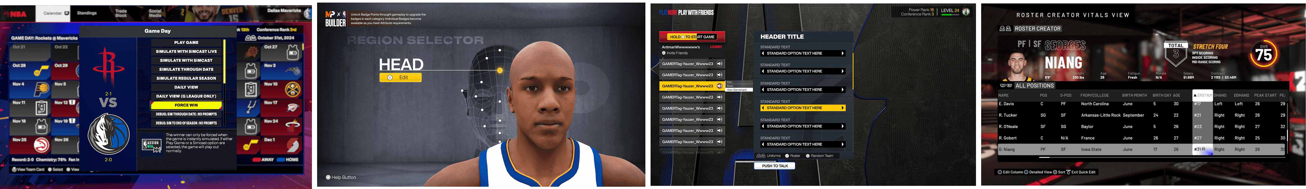
06 Architecture
Layered for speed
When we redesigned the Roster Creator for 2K26, the team built it almost entirely from existing components. The player cards, the panel system, tabs, controller prompts, OVR meters, all existed in the library. Only the layout and the filter dropdown were new. What would have taken weeks took days.

Built entirely with one single panel component by adjusting its properties.
06 Architecture
Layered for speed
When we redesigned the Roster Creator for 2K26, the team built it almost entirely from existing components. The player cards, the panel system, tabs, controller prompts, OVR meters, all existed in the library. Only the layout and the filter dropdown were new. What would have taken weeks took days.
Built entirely with one single panel component by adjusting its properties.
07 - Shipping it
From Figma to engine
Working in Code
I edited color values and token definitions directly in code and maintained the config files that controlled how the system showed up across the product. For animation sequencing, camera assignments, and menu organization I worked inside the codebase myself rather than writing specs and hoping someone interpreted them correctly.
New component types usually required engine features that didn't exist yet, so we ran focused kickoffs where I defined the behavior, engineering built the capability, and then I implemented the component on my end. Early on I sat down with engineers to agree on naming conventions so the design system vocabulary matched what was already in code, which cut down on translation errors and made adoption faster. When I needed something more complex, like formula driven animation controls for meter fills, engineering would open up those systems and I'd wire them into the components directly.
AI Auditing at Scale
The component library had years of debt and auditing 500+ assets manually wasn't realistic. So I used AI to write a script that scanned the codebase for every instance of our legacy panel components, surfaced which screens used them, and logged the properties each one had set. Full picture, one pass.
One example: the system had over 20 variations of the same panel, each built slightly differently for different contexts. The script showed me the different values set in those components and I was able to determine that they could be condensed into three core panel types, a global panel, a decorative panel, and an effects panel, each with configurable properties to handle the variation.
Without AI I could have found the duplicates eventually, but seeing every property across every screen at once is what gave me the confidence to cut aggressively.
Find and Replace, System Wide
I worked with engineering to write a second script that translated legacy properties onto the new components and swapped them across the codebase automatically. No one had to go screen by screen. This was my initiative, and combined with the auditing work it meant migrations that could have taken months happened in focused sprints instead.
Governance
I owned core primitives and tokens but trusted contributors could extend within guidelines.
1. Can it Adapt?
Could an existing component evolve instead of creating a new one?
2. Will It Recur?
Is this pattern reusable across multiple screens?
3. If No to Both → Push Back
Protect the system. Redirect energy toward features that truly require custom work.
Leadership alignment made that discipline sustainable and kept the system from drifting. I also started rolling out accessibility improvements, better contrast on selectable items and removing pure black and white body text. Early stage, more to do there.
What it did for the team
08 - Impact
Before the System
Build artists didn't have a shared reference point. If someone needed a panel they'd look at a nearby screen, find something close, and copy it. If it wasn't quite right they'd make a new one. Colors were picked manually by eyeballing a concept, not attached to any token, so if something needed to change later someone had to update every screen individually. A lot of time went to rebuilding things that already existed and guessing at design decisions that should have been defined.
After
Builders could ship screens without formal concepts. They'd pull from the component library, snap pieces together, and the result stayed consistent because the rules were built into the components themselves. Build time went from roughly two weeks to under a day. During crunch the system held up because the governance was clear: if a component didn't do what you needed, you requested an extension rather than building around it.
Before the system / early days
After implementation
Same product. Before: competing treatments. After: shared language, room for expression.
What I'd Do Differently
Documentation was the gap. The style guide lived in Figma and in engine, but usage docs were buried in a separate tool. New build artists got confused on complex screens because instructions were hard to find. I'd build a unified doc layer earlier, something right next to the components instead of somewhere else.
I was also the sole maintainer. I'd started handing ownership to other leads but needed more time to get that running properly.
Starting Fresh Today
If I were starting a system today I'd feed the existing component inventory through an LLM on day one to get a draft architecture going, then iterate from there instead of building from scratch. Documentation would live alongside the components from the start. I'd use AI for the granular stuff that otherwise eats weeks: cataloging variants, flagging inconsistencies, drafting usage guidelines. I'd also want it to be as plug and play as possible, maybe a dashboard where the team can adjust tokens and see changes cascade in real time, something I could vibe code into a working prototype pretty quickly.
© 2026 by Albert Carmona
© 2026 by Albert Carmona
© 2026 by Albert Carmona